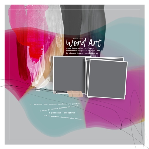
Template Colors
A few weeks back I was talking about the virtues of templates. I thought of something the other day that I probably should have included in that post. Most times templates can be a great source of inspiration. Especially if the colors used by the designer fit your theme. But other times template colors can be off putting even when the design of the template may be quite lovely. I know that has happened to me more than once.
Just take a look at the featured image at the top of this post. The template colors are really bold, almost a neon kind of bold. I can certainly understand how a lot of people would be hesitant to use that particular template.
While wild or bold colors may not keep me from purchasing a template, on some occasions I have initially been deterred from using a boldly colored template based on a first glance. So, a long time ago I had to learn how to keep an open mind whenever I find a template where the colors keep me from seeing the full potential of using it. And there’s a fairly simple trick that can help with that.
Desaturate It

The trick is to keep the template colors from influencing your design decisions by desaturating the bothersome layers. In doing this you can now see the template with a more neutral palette.
Before I get started just a quick reminder; I use Photoshop Elements (PSE) 2024. If you use a different version, some of my screen shots may look different from what you see on your screen.
The template in the featured image above is actually one that I do own. It is from the “Live Wild & Free” collection by NBK Design, released in 2017 and long since retired. But I’m going to use that template specifically to show you how to desaturate the template colors.
I open the template in PSE:
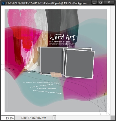
Most of the template colors are actually just paint over the grey background. And here’s how those layers look in the Layers Panel:
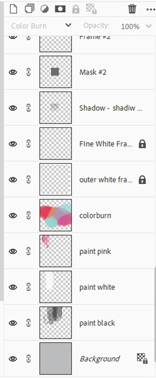
As you can see, there really are only two layers that have those bold colors. The black and white paint layers aren’t quite as bothersome. Before I start messing with any of these layers, I’m going to save this template with a new name so I don’t lose the integrity of the original template.
When I do this the best thing I’ve learned is to simply add the word “Neutral” to the beginning of the template’s name when saving it. Not only does this preserve all the original template colors, it also preserves the template’s original name.
Even though I’ve already saved this PSD file under a new name, I am going to go one step further just in case I decide to use some of the paint colors later. And I’m only doing this because these are paint layers. If they were layers to which I will be clipping papers or photos, I wouldn’t go this extra step.
I’m going to duplicate each of the bold paint layers and hide the originals. And here’s how my Layers Panel looks right now:
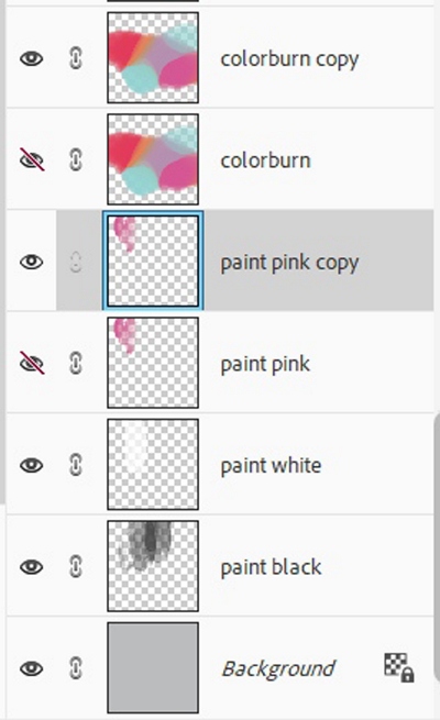
Then in the Layers Panel, I click on the duplicate multi-colored paint layer (colorburn copy) to make it the active layer. Now it’s as simple as pressing Shift+Ctrl+U to desaturate the layer:
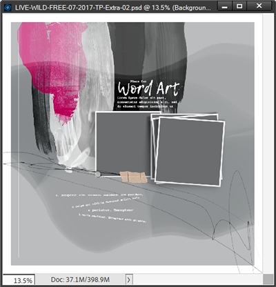
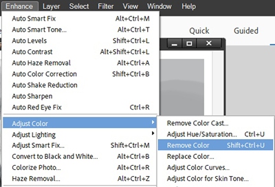
Since it’s sometimes harder to remember shortcuts like the one I used above, I’m going to use the menu path method to desaturate the remaining paint layer. At least this way you know how to do it either way.
With the other duplicate paint layer (paint pink copy) active, I go to the top Menu bar and select Enhance->Adjust Color->Remove Color:
As soon as I select Remove Color, PSE desaturates that pink paint:
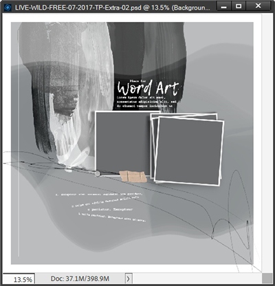
Now I have a very neutral template without a lot of distracting bold colors.
Once I added all the other components of my layout to this template I decided to try clipping a paper to the desaturated multi-colored paint layer to see how that would look. I then also re-colored the pink paint and eliminated the black paint altogether. And here’s how everything turned out:
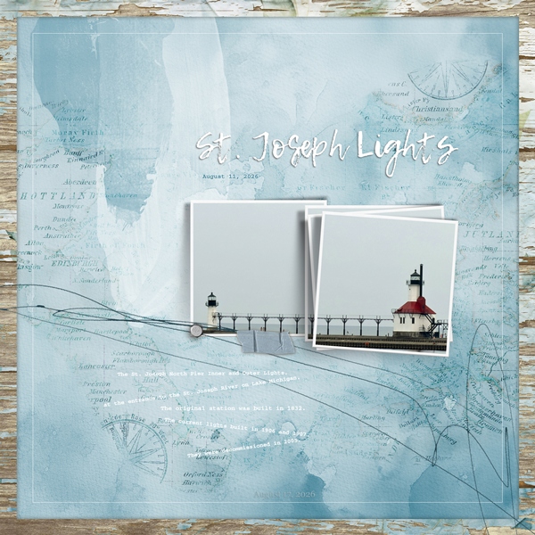
I loved how clipping the paper to the desaturated paint worked. This just goes to show what you can do with a template if you aren’t distracted by bold colors.
Note: If you’d like to see more details about the finished layout you can find it in my 2026 Gallery. The title of the layout is “St. Joseph Lights”.
Do you remember how I saved a copy of the original paint layers? Here’s another alternative to the paper clipping approach I took for my layout.
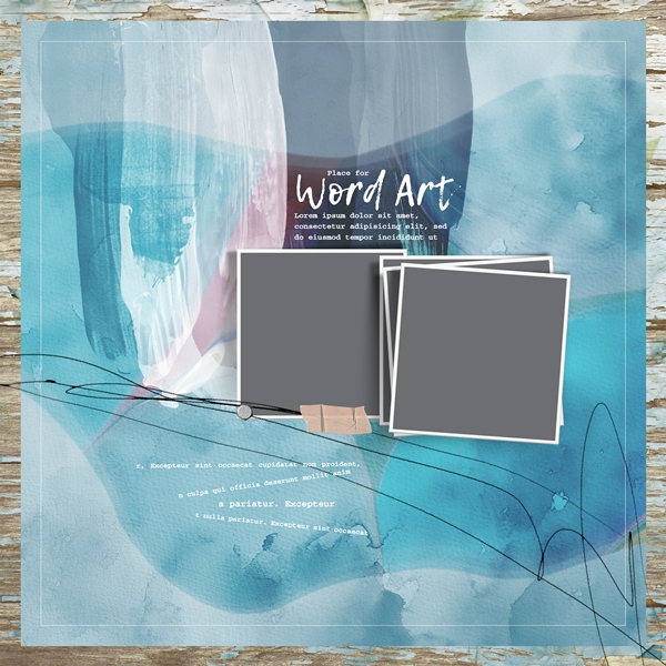
I could have hidden the desaturated layers and unhidden those original bold layers and just recolored them to fit my layout. This could get a little tricky since that one layer has so many colors but it can be done. And if you’ve been following me for most of this year, you already know there are a multitude of ways to recolor just about anything.
And here’s an example of how recoloring that bold paint could work:
And really quick, here’s an example of another template where I desaturated some bold colors:
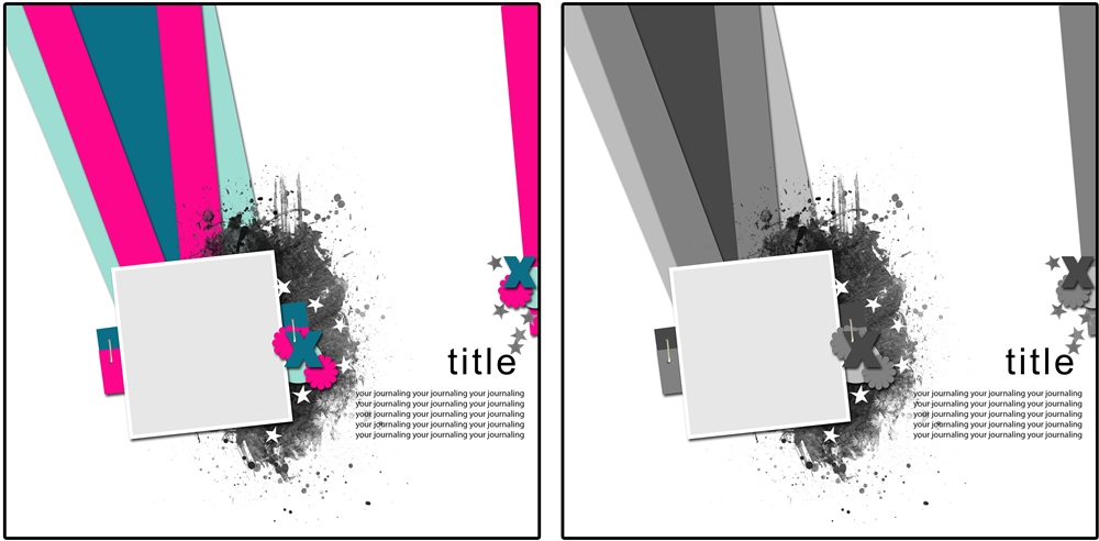
Note: This is a template from “Happy Medium Templates” by Jimbo Jambo Designs (now retired).
Clearly you can see that there’s more than one way to tame the “wild” colors in a template!
I hope this will help you look at templates without being deterred by the designer’s choice of colors.
More Template Colors Tips
First and foremost, always try to look at a template with an open mind. Remember to focus on the design rather than the colors.
If you feel intimidated by the template colors even if it’s not that they’re bold but rather “theme” driven (i.e., Christmas colors), that’s a perfect time to desaturate the layers.
Just as with any other template, not one layer in the template is “cast in stone” you can make whatever changes you need to make to fit your project!
It is the eye of ignorance that assigns a fixed and unchangeable color to every object; beware of this stumbling block. – Paul Gauguin
Thanks for reading this week’s Tuesday Tip. Remember, if you have any suggestions or questions please don’t hesitate to “Message Me”. Check back next week for tips about transforming your journaling. Click “Follow Me” to stay in touch. I hope you have a wonderful week!