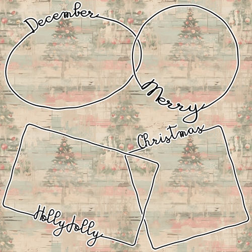
Word Frame
You may or may not be familiar with the type of “frames” you see in the featured image above. I know quite a few years ago that kind of “word frame” for a photo was all the rage. They kind of dwindled off after a time. But I’ve seen them making a bit of a comeback lately.
Most often designers create these as a frame with a clipping mask for a photo. These word frames can be so fun to use. But I suspect their popularity comes and goes since most are limited to certain months, seasons or catchy words.
Today I thought I’d show you how easy it is to create your own unique frame using whatever word fits your photo or theme.
Word Frame Shape
Just a quick reminder; I use PSE 2024. If you use a different version, some of my screen shots may look different from what you see on your screen.
I almost always use a 12×12 file when creating things like these word frames. It gives me plenty of working room. I’d much rather end up with a frame that’s larger than necessary, versus one that’s too small. Making a small frame larger may not be quite as easy as it sounds. At least that’s how I rationalize the large work area 😉
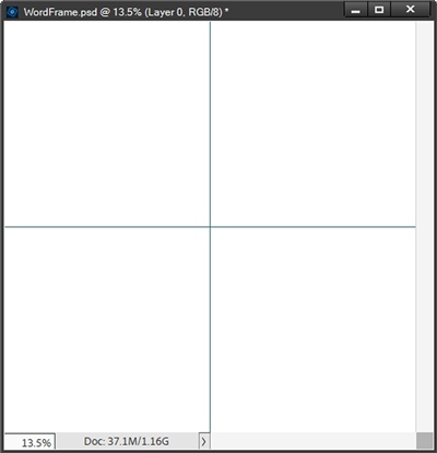
So, I create a new 12×12 file with a white background and set my Foreground/Background color chips to the defaults (press D). I also set my Guides so I know where the center is:
I’ve found that the next best step is to pick the shape I want to use for the photo mask. I can use just about any basic geometric shape I want. I think I’ll start with an oval shape.
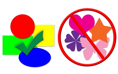
Note: You can use any geometric shape you like. I do discourage using shapes that have hard angles (e.g., stars, diamonds, chevrons, etc.,). Text can either get trapped in the valleys between the points or it wraps over them awkwardly. Not a good look if the word isn’t linear. I do make one exception; arrows can be used as long as they are linear or softly curved.
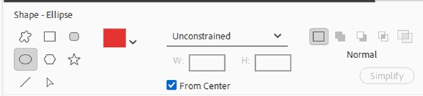
Now it’s time to grab the Ellipse Tool (press U). In the tool options, I set the shape color chip to a nice Christmas red (#e82929). Next, I set the geometry (unlabeled) to Unconstrained, ensure the Create New shape layer icon is selected, and check From Center:
I then position my cursor with the cross hairs centered over the Guides’ intersection. Now I can drag up and to the left until I have an oval with a width of roughly 9.5 inches and a height of roughly 6.25 inches:
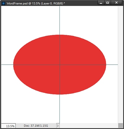
Note: You don’t need to make your oval the exact same size. Nor does it need to be precisely centered. It just makes things easier later if you start out with the shape centered on the background.
Word Frame Outline
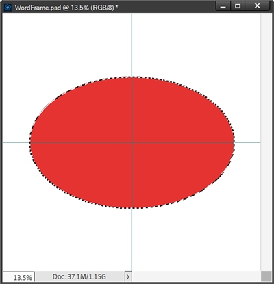
Now it’s time to create the outline that will become the frame. I’m going to create a stroke around the oval. I want the stroke to be black. So, I set my color chips back to the defaults (press D). With the oval layer active in the Layers Panel, I Ctrl-Click on the thumbnail of the layer. PSE then makes a selection around the oval:
I want that stroke to be on its own layer so I click the Create a new layer icon in the Layers Panel. PSE creates a new layer (Layer 2 for me) which is now the active layer. And that’s exactly what I needed. Now I go to the Top Menu bar and select Edit->Stoke (outline) Selection:
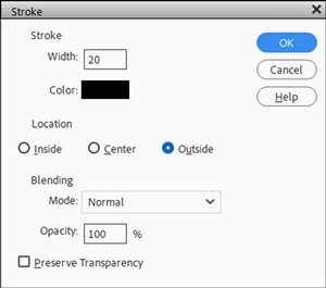
PSE opens the Stroke Dialog box. I set the Width to 20, the Color should already be black and I set the Location to Outside. Blending should be set to Normal, the Opacity should default to 100% and I leave Preserve Transparency unchecked:
I click OK to confirm and cancel the selection (press ESC or Ctrl-D). And here’s my oval with the outline:
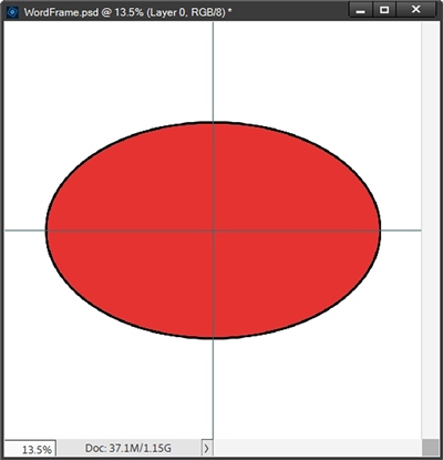
Note: You can make your outline larger or smaller if you like. I do recommend that you not make the outline any smaller than 15px or larger than 30px. Try to keep the width of the outline sized proportionate to the size of the font being used. We’ll look at that more in a bit.
I’m going to rename Layer 2 (the stroke layer) to “Original Oval Outline”. The reason I’m doing this is because I want to show you how to add some fun to the frame. Go back and look at the frames in the featured image at the top of this post, you should be able to see they’re a bit “wonky”.
And it’s really not hard to get that look. But you can skip this next part if you’d rather keep your frame “clean”…totally up to you!
Wonky Outline
The first thing I’m going to do is duplicate the Original Oval Outline layer, hide the original and rename the duplicate to “Distorted Oval Outline”. With that layer active in the Layers Panel, I go to the Top Menu bar and select Filter-> Distort-> Wave. PSE opens the Wave dialog box.
I want this to create a fairly controlled, subtle wave on the stroke. So, I set Type to Sine and the Number Generators to 3. This will keep the distortion from getting overly chaotic.
Then I set Wavelength Min. to 150 and the Max. to 300; Amplitude Min. at 3 and Max. at 5. I keep the Scale Horiz. and Vert. both at 100% and set Undefined Areas to Repeat Edge Pixels:
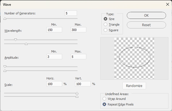
Using these settings generates a smooth rolling wave while keeping the oval’s overall shape structurally sound; the waves will stretch out and appear smooth and gentle with only slight “movement”.
Note: If you read my Wavy Word Strip post back in September, you may remember there’s a Randomize button on the Wave filter. Feel free to click that a few times before confirming the settings to see if there’s another arrangement you like.
It’s generally hard to see the preview but I’m fairly confident with the settings so I click OK to confirm. And here’s my wavy outline:
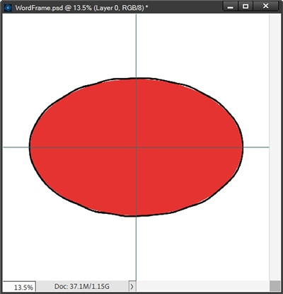
I really like the way that turned out. Wonky frame or not, now it’s time to add the word…
Word Frame Text
I need to confess something before I start on the word. I specifically used an oval shape for one reason; when incorporating text within an oval (or circular) frame, 99.99% of the time that text will need to be warped. It wouldn’t have been fair for me to show you how to do a square word frame and not cover that “warping” issue.
Once again, this generally isn’t hard to accomplish. But I will warn you about one thing; font choice will have an impact on how easy this will be. So, let’s talk about fonts for a minute. There are lots of acceptable fonts out there. You just have to know what you’re looking for.
For this technique it is best to use a “bold” monoline script font. Monoline fonts are clean and minimal. The line width is typically consistent so there isn’t a variation of thickness throughout each letter.
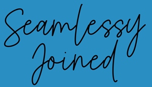
One important feature when selecting the font is that the letters touch each other and are fairly close together. I also recommend that the font stays mostly vertical (upright) with very little slant at all.
Note: Remember I said earlier that stroke size should be consistent with the font’s thickness. Keep that in mind when selecting a font. Stroke size aside, you definitely want a thicker monoline vs. a thin one. It will just show up better on the frame. And if necessary, you can always go back and adjust the stroke outline.
There are several good ones I’d recommend at DaFont: Pillow Talk, Autumn, Honey and Sweety:
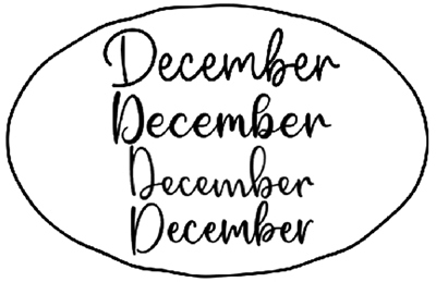
The fonts are shown (top to bottom) in the same order as listed in the sentence above. Those should give you a pretty good idea of the type of font that will work best. You can use one of those or another similar font you have on hand.
I on the other hand, am using the same font I used to create the frames in the featured image at the top of this post: Gadgreaty Bold (from Creative Fabrica). And again, there’s a method to my madness in picking this font! You’ll understand in just a minute 😉
I grab the horizontal Type tool. In the tool options I set the font name to Gadgreaty Bold, Size to 100, Leading to Auto, Tracking to zero and click the Center text icon. The Color is already set to black because of my Foreground color chip.
Note: If you’re using a different font than I, you may need to use a different Size setting. Just adjust that setting so that your word fits nicely above the shape. Try to use my example as a gauge for how much space the word uses. You don’t want it to be so large that it starts to get too close to the edge.
Then I position my cursor near the top of the oval outline aligned with the center Guide and type my word (December):
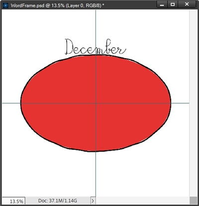
That word is centered perfectly over that red oval. But for a font that has “bold” in its name, it isn’t very bold at all. When I first used this font I just immediately clicked on the Faux Bold icon in the tool options to fix that:
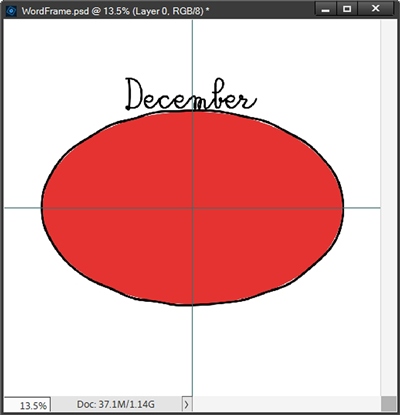
That looks like it took care of the problem. In actuality, it didn’t; I learned that the hard way.
Warping The Text
If I try to warp that text to follow the contour of the oval PSE presents me with this error:
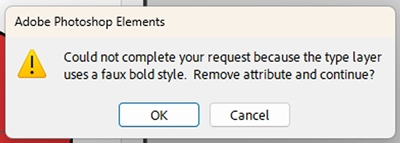
That text warp option will only work with a font that has a natural Bold attribute (part of the font name). And I’m fairly certain you’re asking the same question as I…WHY?
Adobe specifies that the faux bold attribute applies a fake, computer-generated stroke or double-render to a standard font rather than using true vector outline data. PSE (and full Photoshop) cannot cleanly calculate vector distortions or curve paths for text that lacks genuine outline geometry or uses bitmap/simulated weight styles.
But there are viable workarounds. And this is exactly why I stuck with this particular font; it can be fixed and teach you I will 😊
When using a font that would normally require applying the Bold attribute in the text tool options there are actually two alternatives. 1. I can simplify the text layer and then go to the Top Menu bar and select Image->Transform->Warp.
The second option is actually better (at least in my opinion). I don’t have to simplify the text layer which is a huge plus in my book! All I have to do is create artificial “bolding” for the text. To do that I just go to the Top Menu bar and select Layer->Layer Style->Style Settings.
PSE then opens the Style Settings dialog box and I click on the Stroke box. I can leave the Lighting Angle at 90 degrees as it’s irrelevant for this process. I then set the Size to 5px, Position to Outside and ensure the stroke color corresponds with my Foreground color chip:
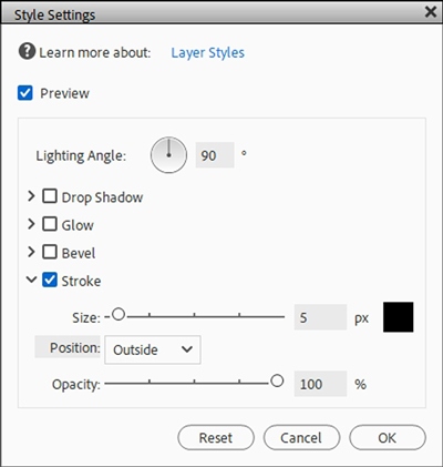
Note: I ended up using a stroke size of 5px because that best matched the look of the font with the faux bold attribute applied. That stroke size may vary from font to font.
And here’s my “bold” text:
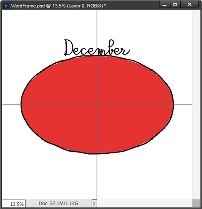
I don’t know that this is any easier than trying to do a “manual warp” on simplified text. I just prefer not having to simplify the text if I can avoid that.
With my text layer active I can now use the Create warped text option in the Horizontal Type tools. When I click that option PSE opens the Warp Text dialog box. I set the Style to Arc, click the Horizontal radio button and set the Bend to 30%. I leave all other distortions set to zero:
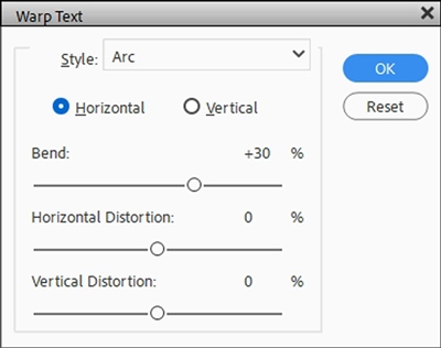
I click OK to confirm and here’s my warped “bold” text:
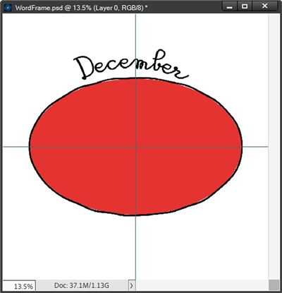
Note: the percentage of Bend will vary based on fonts and curvature of the shape. You may need to change the Bend from what I used today if your text is arched too steeply above the curve. Bend percentages can vary anywhere from 15-40%. Just play with it until it looks right.
Now it’s time to integrate the text with the oval outline…
Join Word To Frame
The first thing I need to do is move that word down so all (or at least most) of the letters are touching the outline:
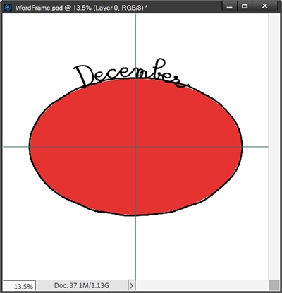
With the Distorted Oval Outline layer active in the Layers Panel, I click the Add layer mask icon at the top of the Layers Panel. PSE applies the layer mask to the layer. I double-click on the layer mask to ensure it is active.
I zoom in a bit to get a good look at how the letters are positioned. Then I grab a small hard round brush with a size of around 35-40px. All I have to do is mask away any of the oval outline between the beginning and end of the word:
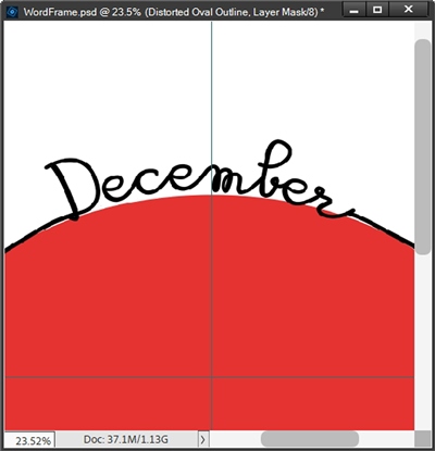
That looks pretty good to me! There is one thing you may or may not have noticed. There is a gap between the first two letters of the word. I’m not too concerned about this because I usually do one more thing before finishing the frame and creating the photo mask layer.
I generally add a white outline around the completed/merged word frame. It just makes the frame stand out more on a layout. It is totally optional.
But if you’re not going to do that extra outline, you will need to close the gap between those two letters. Otherwise, creating the photo mask will get a bit more complex. If you read my Edge to Edge post back in August of 2925, you already know why this is important. If not, you’ll see why in just a bit.
It’s usually fairly easy to close gaps between letters. It just means adjusting the Tracking between the two letters until they touch. For December, I would have highlighted the letters D & e, and set the Tracking to minus 25. That then would have successfully closed the gap. Remember…I’m not doing that right now!
Word Frame Composite
As a precaution I always duplicate my distorted outline and text (word) layers and hide the originals. With the duplicate layers active in the Layers Panel, I then merge those layers together. I rename the merged layer with a meaningful name. For this frame I name the layer “December Oval Frame”
Then I Ctrl+Click on the thumbnail of the December Oval Frame layer to create a selection:
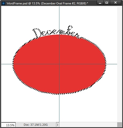
I’m going to create a stroke around the frame the same way I did with the oval. I want that stroke on its own layer so I create a new layer above the frame. With the new layer active, I go to the Top Menu bar and select Edit->Stoke (outline) Selection.
I set the color to white, the Width to 20, the Location to Outside, click OK to confirm and cancel the selection:
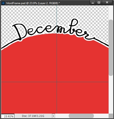
I removed the white background and zoomed in a bit so you could see that the gap between the first two letters is now closed. Again, this outline is totally optional.
Note: I used a stroke size of 20px. You can experiment with other sizes to see what works best with your font and shape outline. But I would suggest sticking with a stroke size somewhere between 15-30px. It will just depend on how things look on your project.
I’m pretty happy with how this turned out. So, now I’m going to merge the white outline layer with the frame layer and rename the merged layer to “December Frame White Outline”.
We’re almost done. All that’s left is creating the photo mask!
Word Frame Mask
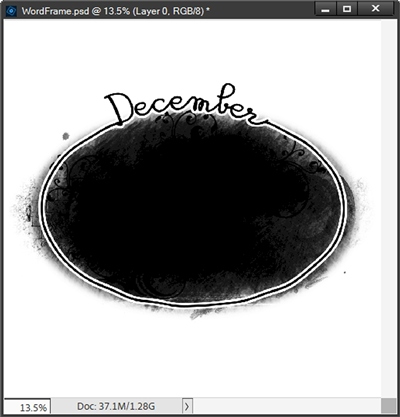
Technically speaking, this step could also be optional. It is entirely possible to use any photo mask you have. I’ve hidden the red oval and removed my Guide lines. Then I pulled in a mask from my stash and moved it directly above the red oval in the Layers Panel. I resized and positioned it so that it extends slightly beyond the edges of the frame:
And here’s how it looks with a photo:
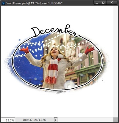
As you can see, that actually worked out quite nicely. That is if you don’t mind the photo extending beyond the frame. And I could just as easily have made the mask fit completely inside the frame for a different look.
But since I’ve made a custom frame, I think it would be nice to also have a custom mask tailored perfectly for the frame. And you know what? It’s easy to make!
I’m going to duplicate the original oval, hide the original and rename the duplicate to “December Photo Mask”. Then I resize the mask so it is slightly larger than the word frame. I also change the color of the mask to a light grey color (#c6c2c2) and simplify the layer:
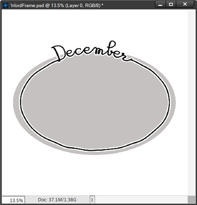
Note: You can color your mask any way you like. I chose grey because that seems to be the pseudo standard used by most designers for “solid” photo masks.
With the mask layer active, I Ctrl-Click the thumbnail of the merged word frame. PSE creates a selection around the frame:
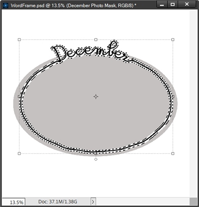
Now I press Delete or Backspace to delete the frame outline from the mask. Then I cancel the selection (press Esc or Ctrl-D) and hide the merged word frame:
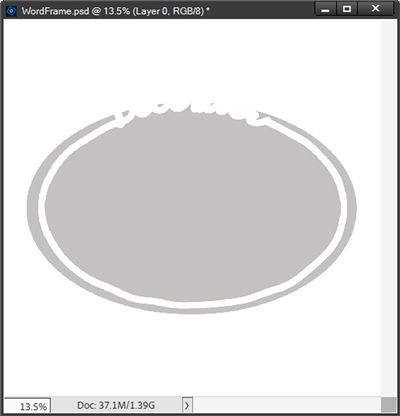
Next, I grab the Magic Eraser tool (press E), set the tolerance to 32 and the Opacity to 100%. Then I check the Contiguous and Anti-aliasing boxes. I can now click anywhere in the outside edge of the Photo Mask. PSE deletes all the grey that was outside the word frame:
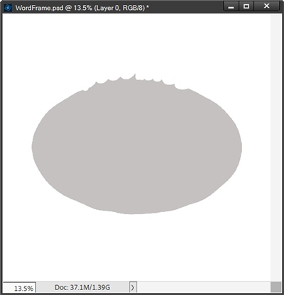
I did have to individually click on the few grey spots that were not part of the contiguous area. But that was easy.
If my letters weren’t all touching (with or without the outline), this wouldn’t have been so easy! Here’s how the initial mask would have looked if there were gaps between letters:
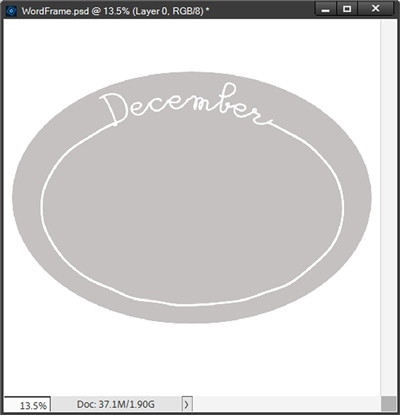
If I use the Magic Eraser with Contiguous set, almost all of the mask disappears:
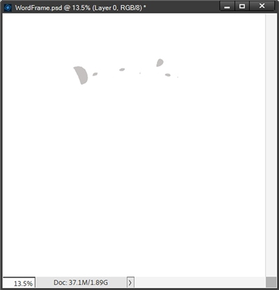
And this is all because of the gap between the first two letters. With that gap, nearly the entire mask (even on the “outside”) is contiguous. This is why it’s so important to ensure there are no gaps between letters!
Now, I’ll go back to the good mask! Next, I unhide the frame, change the background and add a photo:
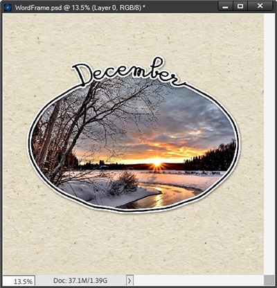
Note: If there are any letters with open spaces (a, e, b, g, p, etc.,) that have photo showing completely inside them, I typically will leave the grey in those mask areas. You can choose to leave the grey or delete it. It’s totally your choice.
I did add a light shadow just so it wouldn’t look so flat. I’m definitely happy with this. I can follow the same steps on other shapes. And it’s even easier to make a square/rectangular frame because I don’t have to warp the text!
And for those of you who are wondering about the white outline; here’s the same fame without that:
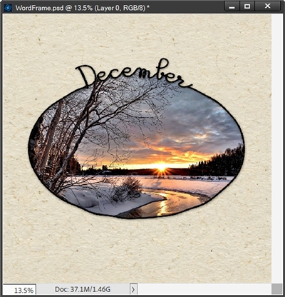
You can decide for yourself which looks better. But I will say this…I think the frame gets kind of “lost”. At least on this photo. Take away the shadow and it looks even worse!
Final Word Frame Example
I want to cover two things very quickly; joining words and letter tails/loops.
Here’s a rectangular frame with two words (a bit offset) at the bottom:
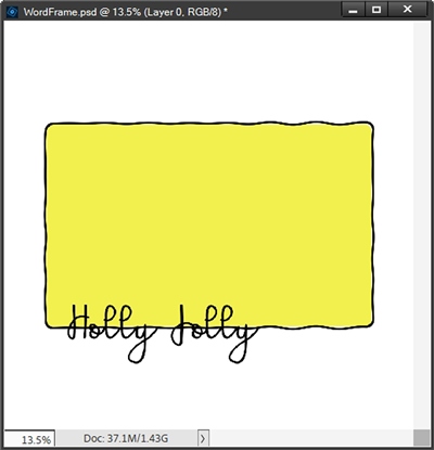
Yes, there is a gap between the first two letters of the word Holly. I’m not concerned about that since the white outline will fix that gap. What I do need to fix is the gap between the two words. I could do that by adjusting the tracking. But I really like the distance between the two words.
So, instead of messing with the tracking I’m just going to leave that bit of the frame in place when deleting the other parts around the words. And I’ll do this using a layer mask just as I did with the oval above:
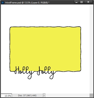
That looks great! Now I can merge the word with the frame, created the white outline and add the grey photo mask:
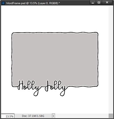
You can see the grey in the loops of the lowercase letter L in both words and the capital J in Jolly. It’s really a personal choice; but I almost always choose to leave the mask in any loops that are above the frame line.
In the case of loops below the frame line, I will generally delete those mask areas (using a layer mask). If I feel differently after adding the photo I can always make additional changes to the layer mask. Here’s how mine looks now:
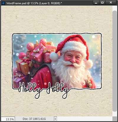
Looking at this now, I kind of wish there was a bit more of the mask on the letter H. That too is easy to fix. I just paint (brush) some grey over the blank part of the photo mask so it looks like it’s even with where the frame line would be. And here’s how the “fixed” mask looks now:
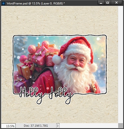
It might look a bit odd since there’s no frame outline at that section. But I still think it looks more balanced this way. Again, something you can decide on your own if you ever run into a similar situation.
I hope learning about making custom word frames was at least a little enjoyable. I know I have fun making them…and hopefully you will as well.
Reminder Tips
Pick a basic geometric shape; preferably oval, square, rectangle or circle. For squares and rectangles use a rounded corner set at roughly 60px.
This technique does not work out well on complex, irregular, or fragmented shapes like flowers, butterflies, snowflakes, hearts, etc. Stars and arrows can sometimes work but only if the word being used isn’t too long.
After creating the outline of your chosen shape it’s always fun to distort it with the Wave filter. This just adds a bit of interest and whimsy to the frame. But it truly is a personal choice.
If you’re not happy with how the wavy frame outline initially looks, simply try running the filter again with the exact same settings. I’ve found that to be easier than “undoing” and starting over.
It is best to use a monoline script font. The most important thing is that the letters touch “automatically” and are fairly close together. It’s also a good idea that the font is mostly vertical (not italic).
If placing text over a circle or oval you will almost always need to warp the text. Use the Arc warp style with a Bend somewhere between 15-40%. The amount of bend will be totally dependent on the size of the shape’s curve.
Most of the time it is best to keep your word centered over the frame. This is true regardless of the shape (circle, oval rectangle or square). That doesn’t mean you can’t try “offsetting” the word on a square or rectangle. But I highly recommend always centering the word over circles or ovals.
You can use more than one word on your frame. Just be sure that the two words are somehow joined. The best way to do this is typically by using the frame outline to join the words.
If you have a tail at the end of a word (e.g. like on an s or a y) and you don’t like the way it looks. Just duplicate and simplify the text. Then you can erase part of the tail so it looks like it fits the frame better.
If you want to put your word at the bottom of either a circle or oval frame, just warp your word using a negative percentage for the Bend.
Generally, it is not necessary to warp words for square or rectangular frames. That doesn’t mean you can’t add a slight warp if you’d like. However, you probably don’t want to use the Warp Style of Arc. The Warp Style of Wave works out much better. You can play with the Bend percentage to see what it looks like. But I have found that a 20-25% (positive) Wave Bend will work with most fonts.
You can also try placing your word along either side of a rectangle or square frame. Playing with a warp would still be an option along the sides.
I typically recommend creating a white outline (totally optional) around the completed word frame. This not only makes the frame stand out a bit better, it will also help if any of your letters aren’t already touching. An outside stroke size between 15-30px tends to work. But that can vary depending on the thickness of the frame and personal preferences.
Let go of perfection – it’s overrated. Your art, with all its quirks and imperfections, is perfect because it’s a reflection of you – unique, powerful, and real. — Arastasia Rolain
Thanks for reading this week’s Tuesday Tip. Remember, if you have any suggestions or questions please don’t hesitate to “Message Me”. Check back next week for tips about school portraits. Click “Follow Me” to stay in touch. I hope you have a wonderful week!