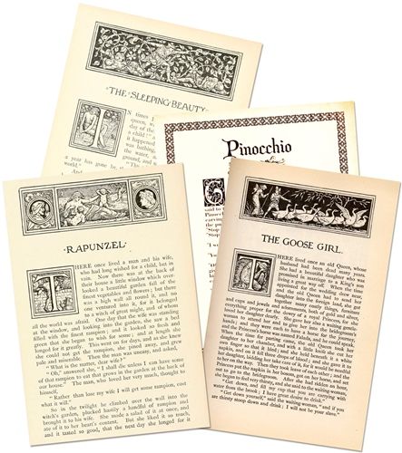
Drop Caps
Since we played with fonts in last week’s post about Dingbats, today I thought it might be fun to work on a fancy journaling technique using drop caps. And it’s funny how our brains work. As I began working on this post I had very vivid memories of a set of fairy tale books from my childhood. Those books all had drop caps. I clearly didn’t know what those were back then but I did know what they meant (at least to me as a child); a new adventure was about to begin!
Contrary to some thinking, drop caps are still prevalent today, remaining a popular stylistic choice in print media and certain digital designs to visually signal the start of a chapter or major section. While some modern designers view drop caps as a “dated” or traditional flourish, they are widely embraced as a means to add warmth and elegance.
Evolution of Drop Caps
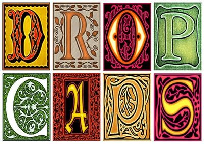
If you’ve been following me for any length of time, you likely know I tend to get caught up in all the little details. That said, I do want to give you a brief history lesson about drop caps (dropped capitals or Initials). To begin, here’s a quick timeline:
- 4th Century (Hand-Drawn Origins): Early codex books lacked word spaces and paragraph breaks. These codices of stacked pages bound together, replaced long papyrus scrolls. Scribes solved this spacing issue by enlarging the first letter.
- 15th Century (The Printing Press): The invention of moveable type forced type foundries to translate these ornate hand-drawn letters into reusable woodcuts and metal type.
- 19th Century (Standardization): During the Victorian era, as commercial publishing boomed, drop caps became more uniform. Typographers typically aligned the cap height of the drop letter with the rest of the first word.
- 20th Century (Modern Decline & Editorial Styling): As modern layout design and grid systems emerged, designers largely phased out drop caps in favor of subheadings, white space, and indentation to guide readers through an article or book.
- Present Day (Digital Revival): Drop caps are experiencing a renaissance in digital publishing. Designers can now easily format drop caps to seamlessly establish tone, add a classical charm, and create breathing room on text-heavy pages.
Drop caps have returned as a way to add warmth, personality, and human-crafted artistry to digital (and print) reading experiences. This trend reflects a widespread cultural desire to bring the charm of physical, high-quality publishing to modern screens. And you’re likely going to be surprised by this next little tidbit.
Millennials, closely followed by Gen Z, are largely responsible for the resurgence of drop caps. This typographic revival stems from a broader aesthetic movement that champions highly tactile, custom, and nostalgic print-inspired visuals within all media.
That concludes today’s history lesson 😉
Drop Caps Fonts
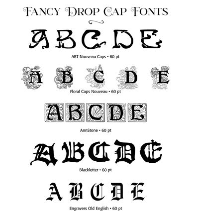
I hate to tell you this but we may actually have another “rabbit hole” situation brewing today? Sadly, drop caps can also become moderately addictive! Each of the fonts shown in the image above are free to download. In case you can’t read their names in the image they are (with download links attached): Art Nouveau Caps, Floral Caps Nouveau, Ann Stone, Blackletter and Engravers Old English.
There are a fair number of other resources available. As far as fonts go, probably the easiest place is once again DaFont. They have a category titled Gothic. Within that category there are three sub categories: Medieval, Celtic and Initials which all have good options. But I found the best options tended to be in the Initials category. I don’t think you can go wrong there. Also, under the Fancy category there is another Initials Subcategory (and it is different than the one under Gothic). I haven’t spent a lot of time there but you can find some good options. And here’s a short list of some of my favorites to get you started. Each font listed will have a download link attached:
- Camelot Caps
- Camelot Initials
- Celtic Eels
- Goudy Initialen
- Medieval Victoriana
- Petit Fleur
- Rose Caps
- Typographer Woodcut Initials One
FontGet is a site dedicated to generating a list of drop caps fonts. It also has an Initials category. Not many pop up under that category so it’s better just to search for drop caps.
FontSpace is another site that has a collection devoted to drop caps. I think there are only eleven fonts in that category. But they’re also worth checking.
If you’re interested in some “clip art” drop caps, The Florida Center for Instructional Technology’s (FCIT’s) Presentations ETC website provides a free, massive library of over 4,000 drop capital letters. Each of the 4,000 colorful drop caps is available in a variety of sizes for convenient personal use. You can browse styles and download high-resolution letter graphics in TIFF format via the Presentations ETC Drop Caps directory.
Using Drop Caps
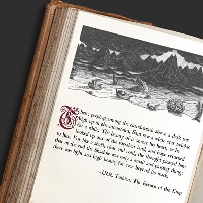
Just a quick comment here before I give you a lot of information about how to use drop caps. Since I’m talking about using drop caps in journaling, you’ll likely only ever use one drop cap on a single layout. So, some of what I’m about to say is really just more basic guidelines about using drop caps in general. But, in the event that you ever do a two-page layout with both having a drop cap, some of what I’ll share will come in handy!
A drop cap should ADD to the text, not DISTRACT from it. If you’re designing a page that is entirely text, a drop cap can soften the page, open up the dense text a bit, and make the page more inviting to read.
Drop caps should be used only for the beginning of entire sections of type such as chapters or major changes of topic. It’s not a good idea to include them on every paragraph.
Styling
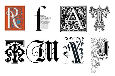
Pick a style that is appropriate for the content of your journaling. If it has a fairytale quality to it, pick a font that fits that theme. If your story is about something somber, perhaps a more medieval font would be appropriate. If you’re just writing about an “everyday” kind of event, go with a more modern typeface. It’s important to choose a style that complements your story as well as the design.
Good typography supports the message without demanding attention for itself. A beautifully chosen drop cap shouldn’t make someone think, “What a gorgeous letter!” It should make them effortlessly begin reading the story. When design disappears into the reading experience, it has done its job well.
Placement
There are three classic options of how to orient the “initial” to a block of “Lorem ipsum” placeholder text in the examples below:
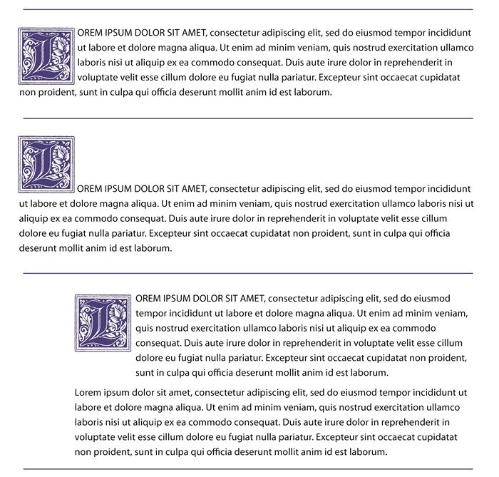
The first is the traditional “Dropped” initial that fits within the paragraph and aligns with the top line of text. Because the letter drops into the text (rather than sitting out in the margin), it keeps the paragraph neatly aligned within the main document margins. This positioning is great for enhancing visual hierarchy and giving documents a sophisticated, book-like appearance. Highly recommended for traditional, heritage, vintage, and literary-themed layouts.
The second is a “Raised” or baseline initial where the baseline of the initial matches the baseline of the first line of text. Unlike a traditional dropped initial, which “sinks” into the body text, the raised cap projects upward into the white space above. It is ideal for modern, minimalist designs, preventing text wrapping issues. Similar to traditional drop caps, they draw the eye immediately to the start of a chapter, section, or article, improving visual hierarchy.
The third example is the “In Margin” or hanging initial, where the entire initial hangs out into a wide left margin. Subsequent paragraphs are then typically aligned with the left edge of the drop cap. This is perfect for clean-and-simple, magazine-inspired, or modern designs because it preserves the left edge of the journaling.
When used appropriately, drop caps can enhance the visual appeal of the text without significantly impacting readability. However, it is essential to strike a balance between aesthetics and functionality.
Fancy Journaling

Think of a drop cap as a quiet partner. The title is the first to attract attention. But the drop cap gently leads the reader into the story. It creates a visual bridge between the “topic” and the journaling, making the beginning feel intentional rather than abrupt. If the design flows effortlessly, the reading experience feels seamless to the reader.
So, let’s tell a story…
Quick reminder; I use Photoshop Elements (PSE) 2024. If you use a different version, some of my screen shots may not look the same as what you see on your screen.
I’m going to start by creating a new 12×12 file using a white background. You can start with a file any size/color of your choosing.
I’ve already decided on which font and placement I want to use for my drop cap. I’m going to be using the “Dropped” style I mentioned above. I purposefully chose this style because it is actually a little bit trickier to work with than the other two (Raised and In Margin). I’ll show you why shortly.
I also have my “journaling” ready to go. Having the journaling ready is important for two reasons; I need to know what the very first letter will be and about how much space I’ll need.
With my white background layer active I open the Horizontal Type tool. In the Tool options, I set the font to Petit Fleur Normal (in my “favorites” list above), the Size to 100 the Leading to Auto, the Tracking to zero, the Color to a deep shade of cyan (#024a6c) and I click on the Left align text icon.
Note: You can use any font, size and/or color that will fit your project.
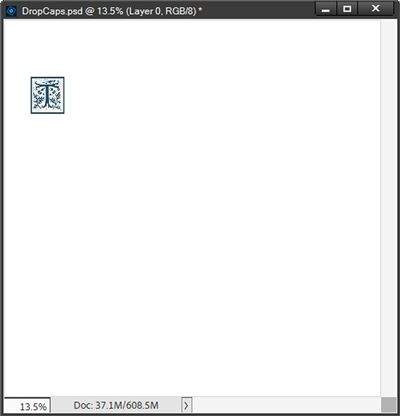
I click once near the top left portion of the file to place the cursor and type the first letter of my journaling. I’m using the capital letter “T” and I click the checkmark to confirm:
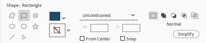
Next, I grab the Rectangle Shape tool. In the Tool options, I set the geometry option (unlabeled) to Unconstrained and click on the Create New Shape Layer icon. If applicable, I ensure there is no active Style. My Foreground color chip is currently set to that cyan color I used for my first letter and that’s what shows up as the color in the Tool options. And I don’t mind that so I’ll leave that alone:
With the white background layer active, I place my cursor crosshairs even with the top-left corner of my first letter then click and drag out a rectangle shape large enough for my journaling. In the Layers panel, I lower the Opacity of the shape layer to 25%, so I can see the first letter:
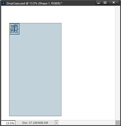
I’m going to zoom in a bit closer on that first letter so I can be certain the placement of my shape is accurate. It looks pretty good:
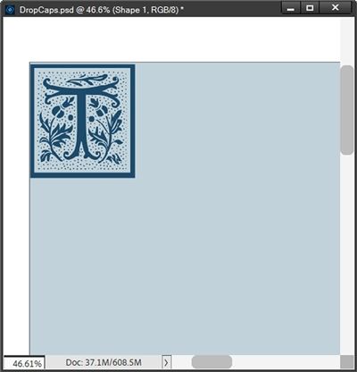
The key here is to be sure that the rectangle aligns properly with the top and left sides of the letter. For me that was easy since my letter is in a square shape. I’m going to zoom in a bit more for this next step.
With the shape layer (and Shape tool) still active, I press and hold the Alt key. I now see my cursor crosshairs with an extra line at the bottom right which is actually representing a “minus sign”:
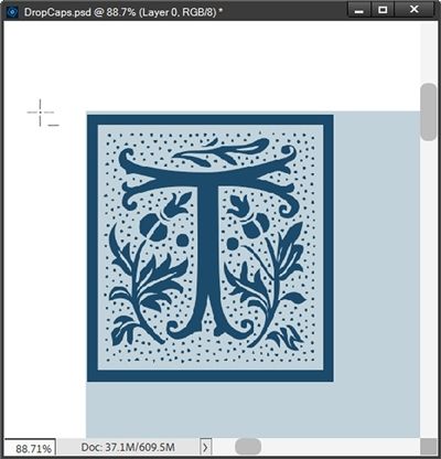
Note: That cursor in the image above is shown larger than actual size. And if you’re following along and don’t see that kind of cursor you need to ensure that your shape layer and the Shape tool are both still active.
Starting just above the top-left corner of the letter, I click and drag, (I can let go of the Alt key once I start dragging) until I get to below the bottom-right corner of the letter. If I need to reposition the box while still dragging, I can press and hold the Space bar. As soon as I release the mouse key PSE subtracts that “box” from the existing rectangle:
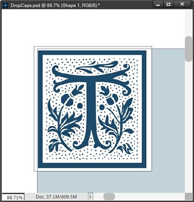
I intentionally made that cutout slightly wider and longer than the letter because I don’t want my journaling text to come right up against the edges of that letter.
If I was using a completely different style of font, my shape placement and cutout might look more like this:
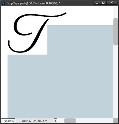
With that particular letter, I intentionally placed the top of my rectangle more than just a tiny bit below the top of that script “T” and closer to the “stem” of the letter. I definitely didn’t want the remainder of the text to be too far removed from the drop cap.
Now back to my letter. With the shape layer still active, I grab the Horizontal Type tool again. In the Tool options, I set the font to an easy-to-read journaling font that will still look nice with that fancy letter. I’m using to Addict Regular and set the Size to 15.5 the Leading to Auto, the Tracking to zero, the Color to an even darker shade of cyan (#02283a) and I click on the Left align text icon.
I then hover my cursor over the top left corner of my shape until I see it change to what looks like a capital “i” (I-Beam) inside of a circle. I click inside the shape to place the cursor. I can then type (or paste) my text, click the checkmark to confirm and hide the custom shape:
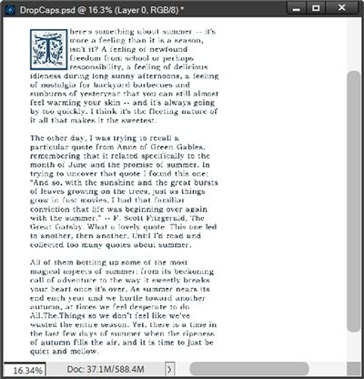
I also have to remember to remove the first letter of the first word in my journaling 😉 If I find that the text is higher or too close to the letter, I can easily move the text box down and over a bit. But it actually worked out just fine.
And it’s perfectly ok if my journaling didn’t fill the entire text box. But, if the box is not large enough, I really have only two options at this point. I can resize the journaling font so that all the text fits. If that’s not a good solution the only thing I can do is delete the shape layer and journaling text layer then start over creating a larger rectangle shape.
And here’s my layout where I used that drop cap and journaling:
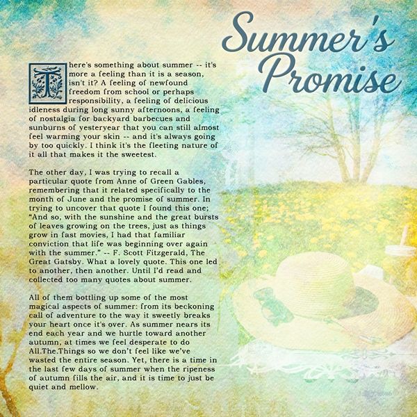
If you’d like to see more details about this layout you can find it in my 2026 gallery.
Now I want to quickly show you how to use the “Raised” and “In Margin” placement options. I’ll be using the same drop cap and journaling I used directly above.
Raised Placement
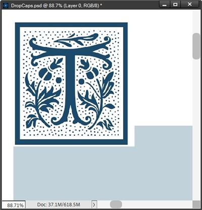
Using the Raised placement option is nearly the same as the Dropped option. But it is easier. Especially if using a font more like that fancy script “T” I showed you above. I’m going back to my original white background with the drop cap. I’m still going to create a rectangle shape. But this time it’s only going to cover just part of the drop cap’s bottom:
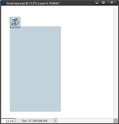
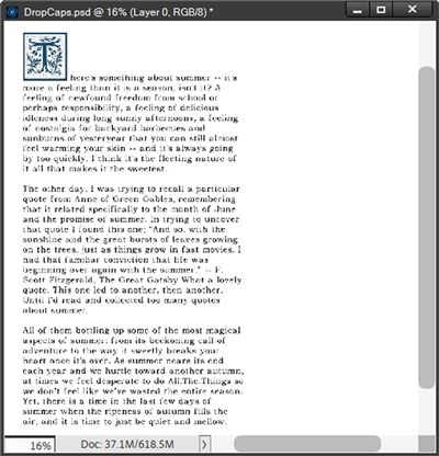
And this time I only have to cut a small notch out of the shape. Remember this placement option has the bottom of the drop cap aligned with the bottom of the first line of text. So that notch only needs to be as tall as a line of text:
And just as before I can now add my journaling:
In Margin Placement
This is by far the easiest. There’s really no need to make a shape at all; unless you really want to. For this option it really just requires creating two text boxes. I’m again going to go back to my original white background with the drop cap.
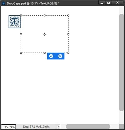
I’m going to create a text box starting at the top right corner of my drop cap and make it as wide as I know I have room for on my layout (roughly no wider than the shape sizes I’ve used previously) and as tall as I need to contain the entire first paragraph of my journaling:
I add my first paragraph of journaling then create a second text box that starts even with the edge of my drop cap, drag it out so it is even with the right edge of the first text box, is spaced below the first text box at a distance equivalent to the space between paragraphs, and is as tall as required to contain the rest of my journaling:
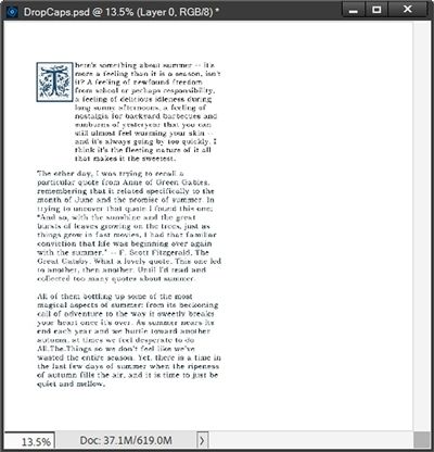
While this is the easiest, I personally don’t think it’s the prettiest. Now that you know how each option works you can decide for yourself which one fits your project the best.
Extra Fancy Journaling
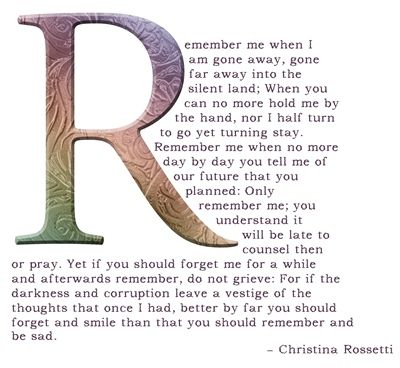
And you can’t get much fancier or obvious than that! Believe it or not, it’s easier than you might think to create that look. Let me show you.
The trickier part here is that achieving the look you see in the image above requires creating a custom shape that follows the contour of the drop cap. And of course, I had to make it less than geometric 😉 And just remember that fancy script “T” I used earlier? This is a great option with exactly that kind of “drop cap”.
Now mind you, it’s really not difficult. But it can take quite a bit of time since PSE doesn’t make it easy for us to type on a non-standard PSE shape (one created without using the Shape tool). But if you read my “Stitches Cont’d” post from back in July of 2024, you should already know how to create a custom shape that will work.
Here’s a quick reminder: All you have to do is create the shape you desire. Just remember, every shape you use to create the end result must be made using one of the standard PSE Shape Tool options: (Rectangle, Ellipse, or Polygon). And you cannot simplify any of those shapes, which means you cannot edit them in any way (other than resizing) once created.
I’ll still run through the necessary steps for creating the shape fairly quickly just so you can see how it works.
I’m going to just go back to my original 12×12 white background. The very next thing I have to do is pick the font for the drop cap. For this particular style a pretty serif or sans serif is generally the best option. Using a font with clean lines makes the next step a bit easier. This drop cap letter is going to drive the shape of the “container” for the text. For the drop cap, I chose Adobe Garamond Pro Regular font.
Other than picking the drop cap font, one of the next most important things is that I know exactly what the remainder of my text will be. This is critical because that “area” needs to become part of the custom shape.
Here’s my drop cap with two text boxes that contain all of the text I want to include:
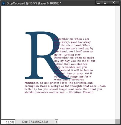
I know this isn’t how the text will ultimately look but it’s a fairly close approximation. All I need to do is ensure I have enough space at the bottom of my custom shape to account for the text shifting within the shape. It won’t hurt anything at all if the custom shape is “longer” than needed.
When creating my custom shapes, I generally start with a rough outline. It doesn’t have to be a smooth outline with pretty edges. It just needs to “roughly” define the shape in which I will type my text. Then I just fill the outline with whatever shapes I need to create a “solid” shape. Again, 100% precision is not a requirement. But I do have to include enough surface area to contain all of the text I’ll be using.
I always create this outline on a new layer above the drop cap and text boxes. One of the most important parts about creating this outline is what I mentioned earlier. I have to allow enough space for the text. Therefore, I need to leave the text boxes visible. But I will lower the opacity to 50-60% just to make it less obtrusive.
This is how my outline looked before I created the shape:
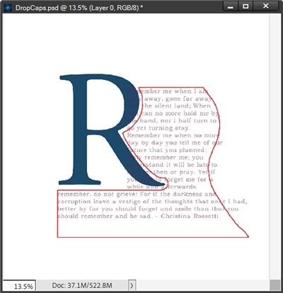
Not only did I follow the outer contour of the right edge of the drop cap, I tried to mimic that same contour on the far-right edge over the text. Notice that I didn’t put the outline too close to the edge of the drop cap. I want a bit of space between the drop cap and the text.
I can now hide the drop cap and delete the text boxes (I won’t need those beyond this point.) I then grab the Shape tool and start filling that outline using one or more of the standard PSE Shape Tool options. And I did end up using the three main ones I mentioned above: Rectangle, Ellipse, and Polygon.
And here’s how my custom shape turned out:
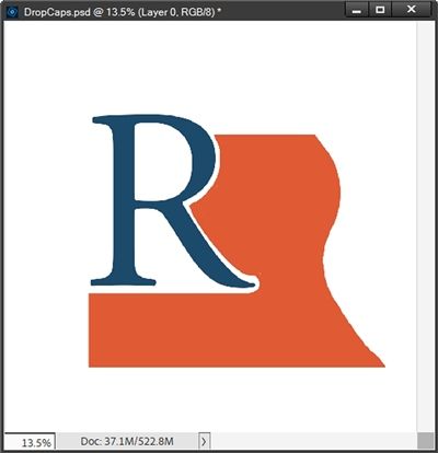
Typically, when creating one of these “custom” shapes, the result ends up being comprised of multiple layers. That is definitely the case here. So, I did merge all of the shape layers together. I did not include the drop cap or outline layers. Again, I DO NOT simplify the merged layer.
With the custom shape created, the rest is easy. Now I just double-click on the shape layer thumbnail to ensure it is “active” – like I would if I was trying to make sure a layer mask is “active”. And this is what happens:
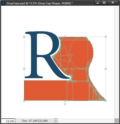
You should be able to see the yellowish-green outlines around each of the individual shapes that make up the composite shape.
Note: If you’re trying to follow along (even using a different drop cap/shape) and you don’t see outlines like those in your shape when you double-click on the thumbnail, something has gone wrong and you’ll need to start over.
Next, I grab the text tool and set my font once again to Addict Regular (link above), the color to a deep purple (#5c3f56), Size to 19px, Leading to Auto, the Tracking to zero and click the Left align text icon.
I then hover my cursor over the top left corner of my shape until I see that same I-Beam inside of a circle that we saw with the first example above. I can then add my text and hide the custom shape:
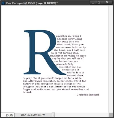
Note: If you don’t see that I-Beam cursor then your shape layer isn’t active. Try double-clicking on the shape’s thumbnail again. Once you see the correct tool…you can insert your text.
From here I just added a few finishing touches to create the image you saw at the top of this section.
Now that you know a bit more about drop caps, I hope you’ll try using one on some journaling. It really can add a touch of artistry and a sense of elegance.
Closing Tips

You don’t have to limit your drop cap to only the first letter. You can also make the entire first word the “drop cap”. I wouldn’t recommend this if you are using a really elaborate font.
Consider using capital letters (or small caps if your font includes them) for the remainder of the first word or phrase following a drop cap. The capitalized word or phrase provides a transition from the large drop cap to the normal paragraph text. Be consistent if you do capitalize. Either capitalize just the first word or capitalize the first phrase (usually three to five words) each time you use a drop cap.
When overused or used on short paragraphs, drop caps can be distracting or make the first sentence harder to read.
Drop caps provide great visual appeal by breaking up dense blocks of text, adding a touch of literary romance to genres like fantasy or historical fiction and by simply calling attention to the story.
A drop cap isn’t just a decorative letter – it’s a visual invitation. It tells the reader, “This is where the story begins.” Used sparingly, it adds elegance and creates a focal point without competing with your photos.
I would highly recommend typing your journaling on your actual layout before even thinking about creating the drop cap. Knowing ahead of time exactly how much space is available for your journaling will make the process so much easier.
When creating the “container” for your journaling, don’t worry if the shape is taller than you need. But always be sure it is no wider than what will fit in the space you have available on your layout.
Creating a custom shape is the best way to go if you’re working with a really fancy script drop cap. Yes, it may take longer but it may end up being the best looking.
When using drop caps, I would highly encourage you to use simple serif or sans serif fonts on the remainder of your journaling.
Avoid using script fonts for your journaling. That tends to take away from the aesthetics of the drop cap. Besides that, I typically find that large amounts of journaling become hard to read if written in script fonts.
In the end, we’ll all become stories. – Margaret Atwood
Thanks for reading this week’s Tuesday Tip. Remember, if you have any suggestions or questions please don’t hesitate to “Message Me”. Check back next week for a few quick tips about type layers. Click “Follow Me” to stay in touch. I hope you have a wonderful week!