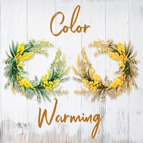
Add Warmth
It’s finally October! Fall officially arrived here in the northern hemisphere nearly two weeks ago. This has by far always been my favorite time of year. Cool weather steadily moves in and things like hot apple cider, pumpkin spice lattes, apple fritters and pumpkin streusel muffins add warmth to the menu of tastes and smells.
Yet there is always a certain sense of indecision when it comes to this season that arrives before winter. So much so that it actually has two names; Fall and Autumn. I’ve always wondered about that! Perhaps it’s just the nature of the season itself. Plants die, or seem to. Yet at the same time they’re at their most magnificent. Some produce a final burst of fruit; others turn vibrant colors. I am relieved for the end of a hot summer, and simultaneously terrified of the long winter ahead.
Change Of Season
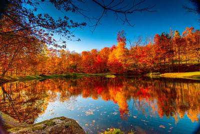
The transition from summer to fall is a bittersweet shift in energy, beautifully reflected in nature’s changing palette. It is the feeling of moving from extroverted radiance to introverted comfort.
Summer’s vibrant colors often carry a high-voltage, restless energy. Leaving them behind can feel like the end of a long, exhilarating party. As the landscape shifts to fall’s palette of amber, burnt orange, and deep burgundy, the colors add warmth and that restless energy naturally grounds itself. The visual noise quiets down, bringing a sense of relief and steady calm.
This same kind of shift happens when we work on our seasonal layouts. And if you’re anything like me, I find that there are some elements (mostly clusters) from summer that I’d love to use on a fall layout. But the colors from summer don’t easily fit in with a fall palette.
Yes, I spent weeks earlier this year discussing the countless ways to recolor just about anything. Unfortunately, clusters are one type of element I didn’t cover. That’s because clusters are not always easy to recolor. Today I’ll show you a really quick way to add warmth to those summer clusters.
Adjust Color Balance
Before I get started here’s a quick reminder; I use Photoshop Elements (PSE) 2024. If you use a different version, some of my screen shots may look different from what you see on your screen.
Today I’m going to be using the Adjust Color for Skin Tone command in PSE. This command automatically analyzes and corrects human skin colors in a photograph to give them a more natural, balanced appearance.
I know I’m talking about recoloring a cluster which clearly is not a photo with people. So, you’re likely wondering how this tool will work on a cluster. It’s still really all about balancing colors. Before I show you how to actually use this option, I want you to understand how the tool works “behind the scenes”.
When I select Enhance->Adjust Color->Adjust Color for Skin Tone. PSE opens a dialog box:
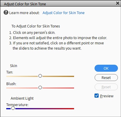
You should be able to see the “instructions” PSE provides in the top half of the dialog box. It’s a good idea to at least read those. But you have to remember, PSE is expecting me to be adjusting a photo with people not a group of flowers.
This tool relies on an algorithmic sample of pixel luminance and mid-tone color to guess skin balance. Since the cluster lacks realistic skin highlights, shadows, and color variance, the automated eyedropper may throw an error (not highly likely) or at a minimum, produce flat, distorted results.
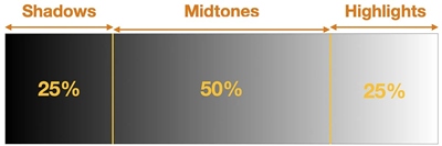
When I click any color area using the tool’s eyedropper, I want to be careful to pick the mid-tone of that particular color; not the lightest or the darkest…somewhere in between. PSE will read that specific color value as the baseline or “medium” tone. The algorithm forces a global or localized shift in hue, temperature, and saturation while still assuming that the sampled color is of human skin.
Non-photo graphics lack the subtle color gradients, luminance variations, and realistic flesh-tone shadow/highlight data of a real photograph. Consequently, the tool can likely produce unnatural, overly saturated, or bizarre color shifts; such as turning bright blue, green, or abstract shapes into muddy orange, pink, or grey flesh tones.
This doesn’t mean it won’t work on a fair number of clusters in your stash. Let’s take a look at how this plays out on a non-skin image…
Add Warmth To Non-Skin Images
I want to tell you how the sliders in the bottom half of the dialog box are designed to work. The top two sliders fall under the Skin category. The last slider is under the Ambient Light category:
- Tan Slider: Adds or removes brown tones. Moving it right increases the brown component, while moving it left reduces it.
- Blush Slider: Adds or removes red tones. Moving it right increases the reddish or flushed look in the skin, while moving it left reduces it.
- Ambient Light/Temperature Slider: Changes the overall color cast of the lighting. Sliding to the right makes the image warmer (more yellow or red), and sliding to the left makes it cooler (bluer).
Even if not using the kind of image PSE is expecting, when I use the eyedropper to click on a baseline (medium) tone, the tool will still attempt to analyze the sampled pixel’s RGB values and shift the surrounding or matching color spectrum toward a standard human skin tone range based on its built-in algorithm.
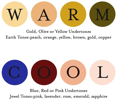
The sliders themselves will still attempt to control the same tones as if I am using a photo with skin. But if my image doesn’t have many skin tones, the results are going to be different. The algorithm is still going to be focused on warm rather than cool colors. And here’s the approach I typically take when adjusting the sliders for non-skin tone images:
Adjusting The Tan Slider (Skin Group)
- Drag it to the right to add deep, rich warmth or golden/olive undertones.
- Drag it to the left to strip away muddy or overly yellow values if the element looks too monochromatic or jaundiced.
Adjusting The Blush Slider (Skin Group)
- Drag it to the right to inject pink or reddish warmth. This is great for making elements look more vibrant, alive, or flushing them with color.
- Drag it to the left to tone down harsh reds or bronzed aesthetics.
Adjusting The Temperature Slider (Ambient Light Group)
- Drag it to the right (Warmer) if the element feels sterile, metallic, or digitally cold.
- Drag it to the left (Cooler) to temper over-saturated oranges or reds, giving it a cooler, twilight, or modern tech vibe.
Now, let’s see if we can warm up a summer cluster…
Add Warmth To The Cluster
I’m going to create a new 12×12 file with a white background and set my Foreground and Background color chips to the defaults (press D). And I’ve pulled in a lovely summer cluster from my stash:
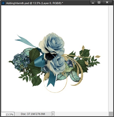
Note: You can use any non-fall colored cluster that you like. But try to avoid any with very cool or highly saturated contrasting colors such as vibrant blues, greens, and purples. I know you may think the cluster above might be a bad choice, but it will work out better than you expect! Mostly because those colors aren’t extremely vibrant.

The first thing I do is simplify the cluster layer. Remember, PSE will not allow destructive changes to a smart object. And if you’ve been following me for any length of time, you already know that just about any image we pull into a file is going to come in as a smart object.
I duplicate the cluster layer so I can preserve the original. I then hide the original cluster and rename the duplicate layer to Warm Cluster.
With the Warm Cluster layer active, I go to the Top tool bar and select Enhance->Adjust Color->Adjust Color for Skin Tone. PSE opens the dialog box:
I’m going to start by clicking once somewhere in one of the medium tones of deep teal in the ribbon to establish my baseline. As soon as I click, PSE immediately adjusts the colors according to the algorithm:
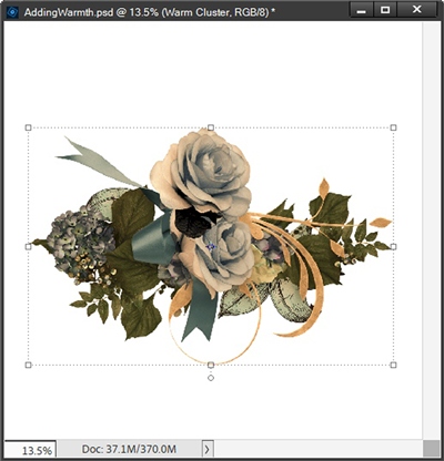
That actually doesn’t look too bad, right?!? The most interesting thing is how the sliders look right now:
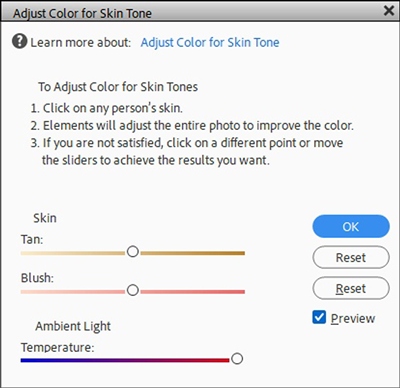
The Ambient Light (Temperature) slider has already moved all the way to the right. Both the Tan and Blush sliders are in nearly the exact spot they were when the dialog box opened. If I wanted to, I could play with moving both of those sliders to see what other changes might occur.
If I move the Tan slider all the way to the right the color of the ribbon lightens up just a smidge and the colors in the rose look ever so slightly softer:
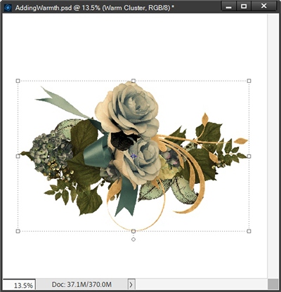
The change is barely noticeable even at full-size.
Now, If I move the Tan slider all the way to the left, the first thing I see is that the Temperature slider has moved back toward the left. And now some of the blue tones have come back making the ribbon less green and the rose more peach:
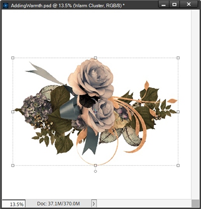
At this point, even if I move the Temperature slider all the way back to the right, nothing changes. So, I’m going to click the Reset button and start over by clicking the mid-tone in the ribbon. That gets me back to this:
Remember, the Temperature slider is all the way over to the right at this point. I’m not going to mess with the Tan slider right now.
Let’s see what happens if I move the Blush slider all the way to the right. Nothing changed. So, I move the Blush slider all the way to the left; again, no change. So, I’m just going to move that slider all the way back to the right.
Now, I’m going to move the Tan slider all the way to the right:
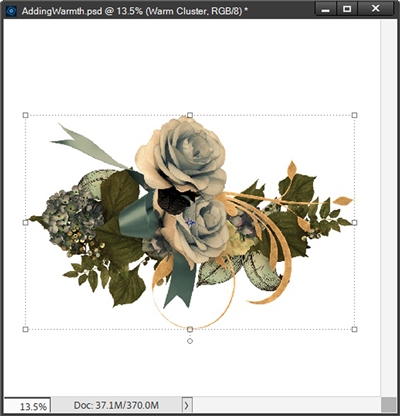
I think this is my favorite version. I’ve got the nice shades of green in the ribbon and the rose has more peach tones. Again, a lot of the changes were very subtle. So subtle in fact, you likely can’t detect the variances in these digital images. Truth be told, I could probably go with any one of the versions.
Now, would I have been happier if this method provided more rich fall tones like burnt orange and burgundy? Absolutely! But for what is basically a one-click modification, I really can’t complain.
I do want to show you samples of some other clusters that also worked using this technique to add warmth.
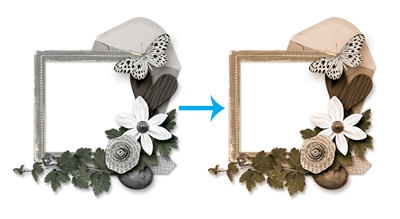
For this Grey Frame Cluster above, I ended up just moving all the sliders to the far right.
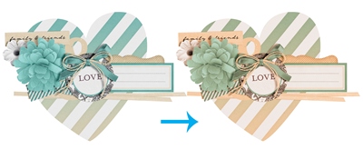
With the Aqua and Beige Heart Cluster above, I moved the Tan & Blush sliders to the far right and the Temperature slider to about the midpoint.
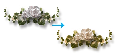
For this White Rose Cluster above, I moved the Tan slider to the far right, the Blush slider to almost the midpoint and the Temperature slider to about the a third of the way toward the right.
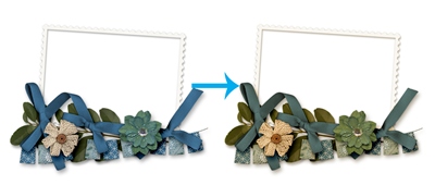
With the Blue Floral Frame Cluster above, I moved the Tan slider to the about three quarters of the way to the right, the Blush slider to the far left and the Temperature slider to the far right.
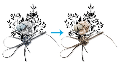
For this simple Floral Cluster above, I left the Tan & Blush sliders at the location that was set after the initial eyedropper click (slightly left of the midpoint). Then I moved the Temperature slider to about three quarters of the way to the right.
Note: All of the slider adjustments mentioned above were made after the initial eyedropper click on a mid-tone color in the cluster.
I hope you can see that this technique actually works fairly well on a variety of color palettes. I hope you’ll give this “one click” warming method a try.
Additional Tips

You can use this technique on a full layer (cluster) or on only a selection within the layer.
Will this work to add warmth on all elements? Technically, yes. You can try using this technique on any element. But not all elements need warming up.
Elements that have a very cool temperature, (deep blues and purples) will not work well. White areas will almost always tend to look yellow so try to avoid white elements or elements with a lot of white in them.
When adjusting the sliders try to make changes slowly. Non-photographic elements with solid blocks of color or clean gradients react very dramatically to small adjustments. Move the sliders in small increments rather than extreme swings.
When adjusting sliders to add warmth, I recommend you start by moving the Temperature slider all the way to the right (if it isn’t already there after the eyedropper click). This tends to produce the most significant changes in color. After that play around with the other two sliders to see if moving them left or right makes much of a difference. There’s no hard and fast science to moving these; it’s all just a lot of trial and error.
When you reach a point where you’re happy with the look, remove the white background, crop to size and save the file as a PNG image. Open that PNG image and try using the Adjust Color for Skin Tone command on the new, warmer cluster to see if you can get any additional warming! I’ve had some success doing this but it does seem to take a bit more fiddling than the first attempt.

As long as autumn lasts, I shall not have hands, canvas and colors enough to paint the beautiful things I see. – Vincent Van Gogh
Thanks for reading this week’s Tuesday Tip. Remember, if you have any suggestions or questions please don’t hesitate to “Message Me”. Check back next week for another quick recoloring tip. Click “Follow Me” to stay in touch. I hope you have a wonderful week!