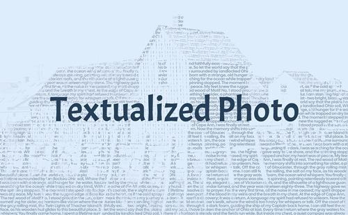
Textualized Photo Text
Have you ever thought about turning a photo into a story? Now what kind of question is that? Of course you have. That’s what we all do. But that’s not exactly the kind of story I want to talk about today. Today I’ll show you how to create what I call photo text and you can watch the photo become a story.
No, I’m not playing word games with you. It’s true, typically turning a single photo into a rich scrapbook story involves focusing on the details, context, and emotions behind the image rather than just the picture itself. This is what usually drives the journaling on our layouts.
And I don’t want you to confuse this version of photo text with some of the other options we’ve all seen before. You know the ones; something that looks like this:
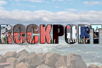
If you read my post about using photos on text back in October of 2023, you should be familiar with these. And oddly enough, that old post also had “Photo Text” in the title. Guess my memory’s not so good when it comes to old post titles heh 😉
These are fun and they have a place. But what if the photo can almost literally tell the story? Keep reading…
The Technology
I know, for most of us who’ve been around since the 1900s, it may sound a bit far-fetched to think about turning a photo into words. But seriously, these kinds of images aren’t completely new. But a lot of the older ones take a different approach than what I have in mind for today’s photo text.

And for those of you who’ve “grown up” in the digital world, you’re likely thinking “Oh, she’s going to use AI!” Well, that just means you haven’t read my “Pet Peeve” post from January of this year.
Yes, I’m sure people can use Claude, ChatGPT, Sonnet, Gemini or one of countless other non-human means to do the heavy lifting. But it won’t change the fact that a human will in all likelihood still need to write the story.
And in my humble (and somewhat dated) opinion, I’d really rather not completely relinquish control to a nebulous machine. That said, I’m going to show you how a human can create photo text using Photoshop Elements (PSE).
Photo Text Story
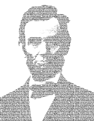
I created the image above using a portrait of Abraham Lincoln and the words from the Gettysburg address.
I know I keep saying that the photo is going to tell the story and that is not quite 100% accurate. I’m certain you can tell it’s going to be very difficult to read the entirety of the Gettysburg Address in that image. But I think you get what I’m trying to accomplish with you today. And it’s probably a safe bet that you’ve seen images similar to this before.
Now, let’s take a look at what it takes to do this. To start, I’m going to create “the story”.
Just a quick reminder; I use PSE 2024. If you use a different version, some of my screen shots may look different from what you see on your screen.
I’m going to create a new 12×12 file with a white background and set my Foreground/ Background color chips to the defaults (press D).
To create a high-quality typographic effect, it’s best to use a font that packs together tightly, has consistent line weights, and offers multiple weight variations (from light to ultra-bold) so the system can handle the shading transitions smoothly.
Sans-serif fonts are generally the best choice because their clean edges and lack of decorative feet (serifs) allow them to blend into shapes and textures perfectly without creating distracting visual artifacts. Now, that doesn’t mean you can’t use a serif font. It’s just usually not the first choice.
Given all of that, I’m going to use a font called Cal Sans Regular. It’s a font you can find for free at Google Fonts.
Note: You can use almost any style of font you want. Though I do highly recommend that you avoid script or grunge fonts. Here are some other good fonts to try: Helvetica Neue, Inter, Impact, Anton, Futura Bold, Futura Extra Bold, League Gothic, Bebas Neue and Courier New.
I grab the Horizontal Type tool. In the Tool options, I set the font to Cal Sans, the Size to 12, the Leading to 11, and the Tracking to zero. I ensure the color is set to black and click on the Left align text icon:

Note: If you’re using a different Size for your font, you will likely need to use a different setting for the Leading value. In general, a good rule of thumb in this technique is to set the Leading one point lower than your font size. This may not always work but you’ll have a chance to check it later.
On my file, I click and drag to create a text box that is the size of the document. I want the text box boundaries to be exactly the same as the file boundaries:
I have a poem that I’m going to use for this effect. In order for that poem (or any other text) to work with this technique I can’t keep the typographic “structure” typically found in poems or songs (groups of short lines and multiple blank lines). Text that doesn’t go from edge-to-edge or has blank lines just won’t work out well.
So, I take the poem I’m using and paste it into a new document in my text editing software (Microsoft (MS) Word). I then format the poem so all the lines run together and leave no blank lines. I copy the reformatted poem out of my MS Word document and paste it into this text box:
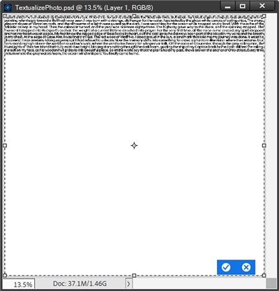
My poem is about memories associated with the photo I’m using. But this is where you can be creative and tailor your text to your photo. Type whatever you want to say. Make it meaningful…tell a story. But it’s entirely up to you how you fill the space.
For purposes of following along you can simply use the generic placeholder text “Lorem Ipsum”. Whatever you type, please do keep a copy of your original “block” of text in a file outside of PSE so you can refer back to it later if you need to make changes.
Clearly my poem didn’t fill the entire space. All I have to do is press Ctrl-C to copy the highlighted text. Then I press the Right Arrow key once placing my cursor at the end of the text. I add a space and press Ctrl-V to insert the copied text.
I repeat this process multiple times until the text box is full. I DO NOT click the checkmark to confirm just yet:
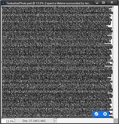
Before I commit this text, I need to do a few more things. First, I’m going to click somewhere within the text box and zoom in very close so I can double check the spacing between each line of text. I don’t want the lines too close together or too far apart:
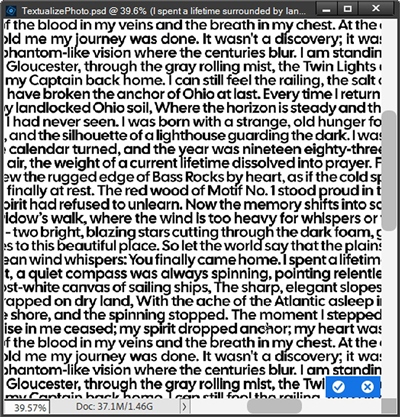
Mine looks pretty good. I don’t mind if tails of lowercase letters are barely touching the tops of taller letters below. It doesn’t have to be incredibly precise; I just don’t want much of an overlap anywhere.
Note: Depending on the font Size and Leading values you use, you may need to make adjustments to the Size and/or Leading values. And this is exactly the time to do that! Just select all the text and make the necessary adjustments.
I zoom back out to the full view and press Ctrl-A to highlight all the text again. With all the text selected I press Shift+Ctrl+J to justify the type:
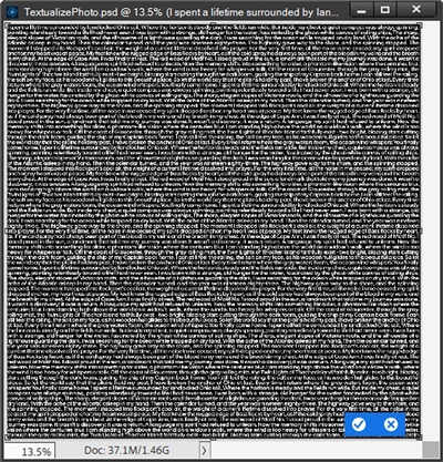
Why did I do this? Because I want all the text justified (edge to edge spacing) so that it covers the entirety of the text box. I don’t want any big gaps along the edges. If you look back to two images ago, you’ll see what I’m talking about.
Note: Depending on any Size and Leading adjustments you might have made, you may now find that your text no longer fills the text box. If that is the case, simply refer back to the copy of your original text and paste it in again until the text box is full.
One last little thing. And it’s strictly optional; I just want you to be aware. If you’ve been following me for very long you already know I’m a Type-A personality with OCD tendencies and can get fussy about keeping things “tidy”. Well, at this particular point it is entirely possible that some text has gone outside the boundaries of the test box.

Yes, that can happen! Shocking, I know! In PSE if I paste more text than a bounded text box can hold, the extraneous text becomes hidden overflow text; it still exists within the text layer but is pushed outside the visible boundaries of the text box. And this happens regardless of the text box’s size!
And there’s an easy way to determine if some text is outside the boundaries. In my text box, if I press Ctrl+End, PSE moves my cursor to the very end of the text. If I don’t see my cursor at the bottom right corner of the text box, that means there’s more hidden text!

Does this matter? Not really, extraneous hidden overflow text will not cause any noticeable issues with file size in PSE. What can matter is workflow confusion. If someone else opens the file or if I later expand the text box (if it isn’t already full size), unexpected text will reappear, potentially breaking up my layout or just leading to general confusion (after all I am on the older side 😄)
Me being me, I typically like to keep my project completely clean. So, my best practice in this case is to do the following.
With the text box full (and still not committed), I click somewhere in the bottom line of text and press the End key. This positions my cursor at the end of the last visible line of text. I then press Ctrl+End. This will select any text that has gone outside the boundaries of the file. I then press the Delete key to remove the hidden text.
From time to time this can result in a small gap at the end of the very last line. Typically, the entirety of the text is not going to end up on my photo. In those cases, I can ignore the gap. But if that bottom right corner is likely to end up at the bottom right corner of a very large photo, I will fill the gap with the missing letter(s) as necessary.
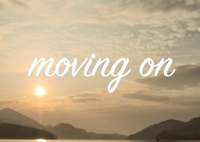
Hidden text deleted or not, here’s what the final text box should look like and I can now commit the text:
Edit Photo
I’m going to use a photo of my own for this demonstration. If you look at the featured image at the very top of this post, it may look very familiar:
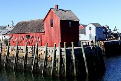
Note: You can use any photo you choose. The steps will be the same regardless of the photo. Just keep in mind that there should be a definitive subject. Portraits with high contrast subjects work best. A color photo is not a requirement; you can start with a black and white photo if you choose.
I am not placing this photo in my file with the text just yet. I simply open it directly in PSE:
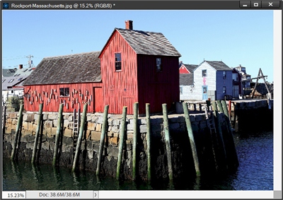
In the top Tool bar, I click Select->Subject and PSE does a reasonable job making a selection:
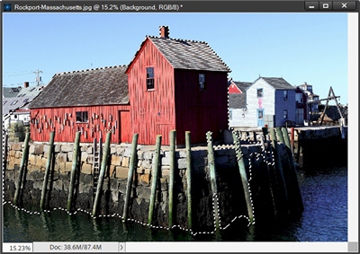
Note: Since Select->Subject wasn’t available in PSE until version 2020, some of you may not yet have access to that. If that’s the case for you, use the selection tool that is most comfortable for you and make a selection around your subject.
I do want that selection to include a bit more of the surroundings. So, I use the Selection Brush tool and Add or Subtract areas until I’m happy with the result:
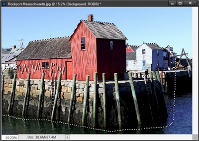
Note: This selection does not need to be perfect. You don’t have to worry about stray hairs or minor details not being selected. A lot of those finer details won’t end up being noticeable in the final image anyway.
With my final selection made I press Ctrl-C to make a copy of the selection. I then go back to my file with the text layer, temporarily hide the text layer, activate the background layer and press Ctrl-V. PSE then pastes my selection onto its own layer in my original file:
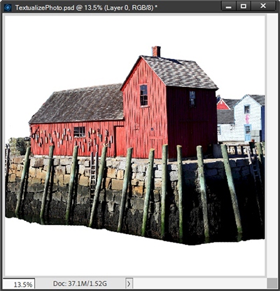
Instead of making a copy of the selection in the original photo file, I could have pressed Ctrl-J to place a copy of the selection on its own layer with the original photo. I would then just “drag” that selection layer to my original file (with the text). You can use whichever method feels best for you.
If I chose to place my selection on its own layer in my photo I would also save that photo (with the selection) as a PSD file. This could come in handy if I mess something up in the next step. Today I chose just to make a copy of the selection. So, it’s now safe for me to close the original photo without saving it.
Photo B&W
Even if you’ve started with a black and white photo, it is imperative that you follow this process from the beginning. If you skip the first step, results may vary significantly. This could ultimately change the way your photo text turns out in the end. As you read through the rest of this section hopefully, you’ll better understand why this first step is so important.
With the selection of my photo active in my file, I click the Create a New Fill or Adjustment Layer icon in the Layers Panel and select Hue/Saturation. PSE opens the dialog box; I set the Saturation to -100 (move the slider all the way to the left) and close the dialog box:
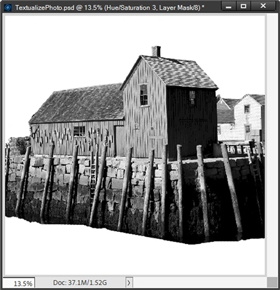
You may be wondering why I chose to use a Hue/Saturation layer versus just using Enhance->Adjust Color->Remove Color or Enhance->Convert To Black and White. The reason is, for the next step to work, I need the photo colors reduced to the purist versions of black and white (monochrome).
Using the Hue/Saturation layer reduces color purity mathematically without choosing how different colors translate to grey. This means PSE strips the intensity or purity from every pixel equally.
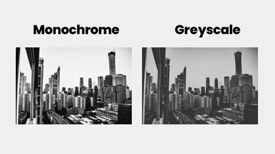
Using Remove Color is nearly equivalent to desaturating with Hue/Saturation. That command dumps color data instantly creating a greyscale image. But it may not always be mathematically accurate.
Just take a look at the image directly above. Monochrome and Greyscale are not always the same. Greyscale is more in line with how a standard black and white photo looks. You can try using that command. However, I have found it is best to work with the recommended Hue/Saturation option.
Using Convert to black and white involves the use of preset styles or dedicated color channel sliders. These are designed to provide more control over color changes to create a custom greyscale look. This means there is also virtually zero control over the luminance (brightness) of individual color channels. Definitely not a good option for this technique.
I know that was a lot of information. But, I’m one who believes in giving people the reason why behind the how! I hope that makes sense 😉 Now let’s get on to the next step…achieving absolute black and white.
In the Layers panel, I again click on the Create a New Fill or Adjustment Layer icon. This time I choose Posterize. In the dialog box, I set the Levels to 2 and close the dialog box:
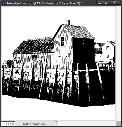
Reducing the Levels down to 2 means there will only be two colors left in the photo. In this case, I end up with pure black and pure white, which is exactly what I need. In the layers panel I then select the image layer, the Hue/Saturation layer and the Posterize layer.
With those three layers active, I press CTRL-E to merge those layers together.
I now need to remove the white from this merged image in order for this technique to work properly. And I know you have to be wondering why I need to remove the white. It’s because I don’t want any of my text to show up in those areas later. In the simplest terms, I actually sort of need the colors in this image to be reversed. I know this sounds weird but it will make sense in a few minutes.
I imagine you’re guessing I’m simply going to press Ctrl-I (Ctrl + capital letter i) to invert the colors. Oh, if it were only that simple. Here’s what happens when I do that:
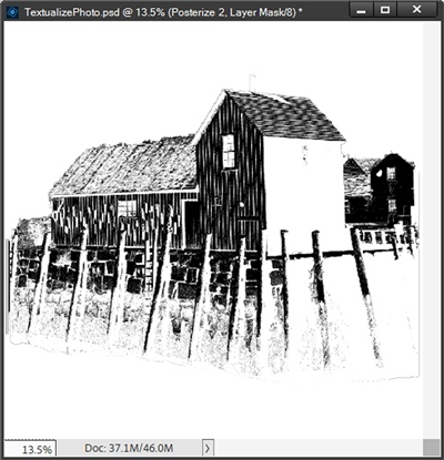
That’s definitely not what I want. What I have here is actually a negative of the image. You can see how all of the original black is now white and the white is black. And at this particular point in the process, I still want all of the original black just without any white.
What I really need right now is to undo the inversion:
As I mentioned above, I actually need to remove all those white areas completely. In order for you to better see what this does, I’m going to temporarily hide the white background:
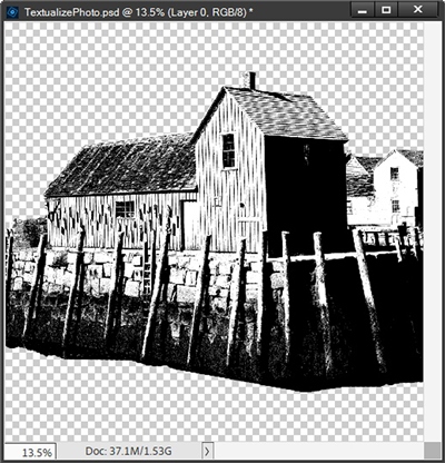
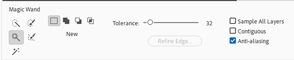
Now it’s fairly easy to see where all that white is. I’m going to use the Magic Wand tool to select all the white. In the Tool options I click the New Selection icon, set the Tolerance to 32, uncheck Sample All Layers and Contiguous, but I ensure that Anti-Aliasing IS checked:
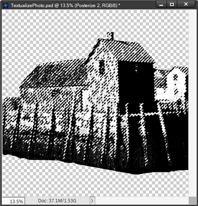
Now I click once anywhere on the photo that is white to select all of the white pixels:
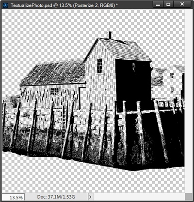
I am going to temporarily zoom in fairly close just so I can ensure all the white is selected. It looks great. So, now I can press the Backspace or Delete key to remove the selected pixels and cancel the selection (Press D or Esc):
Now, I’m about to do something that might seem counter intuitive. I need to recolor the black in this image to white. I know you’re shaking your head and thinking I’ve perhaps gone a bit off my rocker. Trust me, this will all make sense in a minute.
It is all those black areas that comprise the “body” of that image. This is what will ultimately define the look of my photo text. For that to work, all that black must be white so I will be able to see my text later. Please just trust me!
I need to ensure that my color chips are at the defaults and then swap them so that the white is on top. Then in the Layers Panel I press Ctrl-Click on the thumbnail of the image layer to make a selection around all the black:
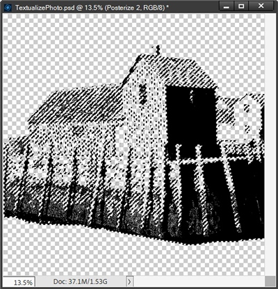
Next, I press Alt+Backspace to fill the selection with white and cancel the selection (Press D or Esc):
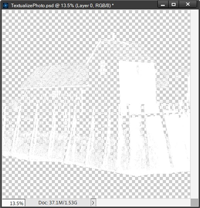
That building now looks rather ghostly at this point. But wait until you see what happens when I unhide the background layer:

The building has almost completely disappeared. And this is exactly what I’m looking for. You may be wondering why we can still see the faintest outline of the image even after I filled it with white.
Well, here’s why; even though the “Posterize” adjustment was meant to reduce the image to only two colors, the edges of the black sections still have a slightly muted (greyish) edge. When I made the selection of the black PSE did its job and included both the black and the greyish colors.
So, why did filling the selection with white seem not to work? The grey isn’t really a solid grey. Rather it is a translucent version of the black. PSE filled the entire selection with white but those translucent areas are the reason why we still see the faint outline. I wanted to point this out specifically so you wouldn’t think something didn’t work properly. Everything worked exactly as intended.
Now for the final step…
Photo Text Image
With that “ghost” image layer active, I set the Blend Mode for the layer to Multiply. I do this so the white (and any translucent) pixels will actually “disappear” into whatever background paper I end up using for my layout.
I unhide the text layer and if necessary, move it above the image layer (though it should already be there):
I then clip the text layer to the image layer:
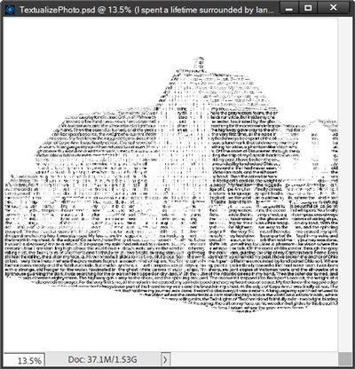
All of the white areas I removed are showing up as white and all of the black areas that I changed to white now contain the text. When I copy the text and image layers to my layout, the areas that appear to be white right now will take on whatever color is beneath them.
And here’s my layout using this particular photo text:
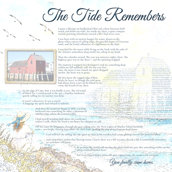
Yes, I ultimately ended up including the poem as my journaling anyway. But I do love how the photo text worked as part of the background. I almost felt silly putting the actual photo on the layout but that building has a special place in my heart so I couldn’t leave it off.
And here’s another layout of mine using photo text:
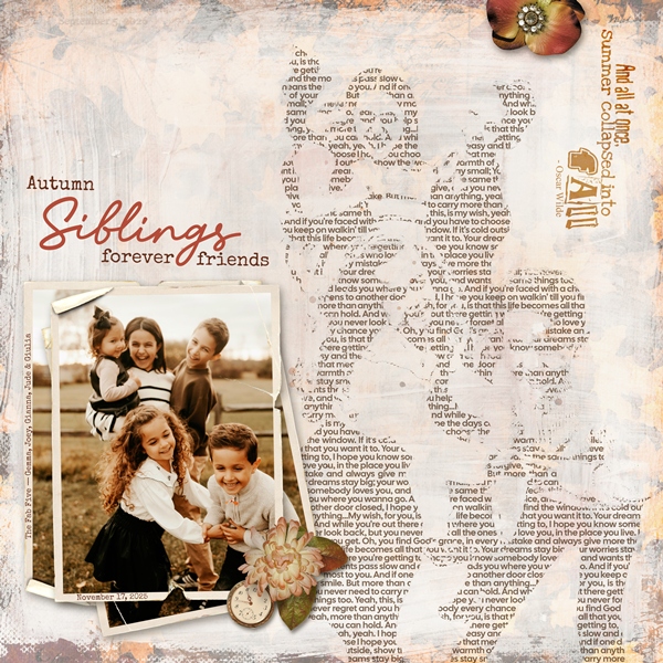
Looking at this layout, you can get a good idea of how photo text looks when there are multiple subjects in the photo being used.
If you’d like more information on these layouts, you can find them in my 2026 Gallery. The first one’s title is “The Tide Remembers”. The second layout’s title is “Autumn Siblings”.
I hope you’ve enjoyed learning about photo text and will give it a try. It takes a little bit of extra work but I think the reward is worth it!
Extra Tips

No, the photo text doesn’t really tell the actual story. But depending on the text and the photo used, you can still glean a lot of the story from the image. You may still need to include some journaling.
Portraits with clear subjects and a simple background work best with this technique. Photos with single, well-defined objects can also work.
Your photo doesn’t need to be in color. You can start with a black and white photo. But you still need to desaturate and posterize it to ensure you get the predictable results.
I highly suggest that you not use photos where the subject is all one color or lacking significant contrast variation. This can easily happen if you’re using a black and white photo.
Photo text (or textualized photo) tends to look best on a layout that is more in the artsy category. I almost always chose an artsy-styled paper to help reinforce the artistic design of the photo text image.
Including the original photo on the layout can help visually explain what the textualized photo is. Sometimes it’s not always easy to tell without another point of reference.
Due to the large text box used to create the photo text, don’t forget to hold down the Shift key when creating any new text layer(s) on your layout.
Prioritize the Type Family: Choose a font family that includes Light, Regular, Medium, Bold, and Black weights. You can use the lighter weights for the bright highlights of the photo and the heavier weights for the shadows.
Tighten Your Spacing: Sometimes you may need to manually reduce both Tracking (letter spacing) and Leading (line spacing) to prevent gaps. The text needs to act as a cohesive texture or fabric, rather than readable individual sentences.
Avoid High-Contrast Serifs: Fonts like Times New Roman or Bodoni have thin horizontal lines and thick vertical lines. When scaled down, the thin lines disappear, breaking the illusion of the portrait.
If your text looks too “bold” when you clip it to your image, you can change the opacity and or color of the text so it coordinates better with the other colors in your layout.
Far and away the best prize that life offers is the chance to work hard at work worth doing. – Theodore Roosevelt
Thanks for reading this week’s Tuesday Tip. Remember, if you have any suggestions or questions please don’t hesitate to “Message Me”. Check back next week for tips about adding warmth to an element. Click “Follow Me” to stay in touch. I hope you have a wonderful week!