Vellum Elements
Over the years I’ve discussed using vellum multiple times. One of my favorite posts about vellum was the “See-Thru Title” post back in March of 2025. Today I want to give you a different way to look at vellum elements. It’s a great way to control the chaos on a layout by using vellum to tone down some of the images.
I know it sounds odd to talk about chaos on a layout. But I’m sure we’ve all seen at least a few layouts that could fit that category. I know I’ve mentioned at least once that vellum is great way to tone down a busy (chaotic) background paper. But chaotic paper isn’t always the culprit.
Control Chaos
I can’t tell you how many times I’ve finished a layout only to find that I went a little overboard with embellishments or journal bits. This can happen to any one of us. When we’re focused on individual details, we tend to lose site of the bigger picture.
Often the issue isn’t chaos itself. Rather, it is finding a way to include certain things without hiding or over shadowing others. That’s when creating vellum elements can really come in handy.
So, today I want to show you how to take flat elements, word art or even text and create vellum “stickers” or overlays.
Simple Vellum Element
Just a quick reminder; I use Photoshop Elements (PSE) 2024. If you use a different version, some of my screen shots may look different from what you see on your screen.
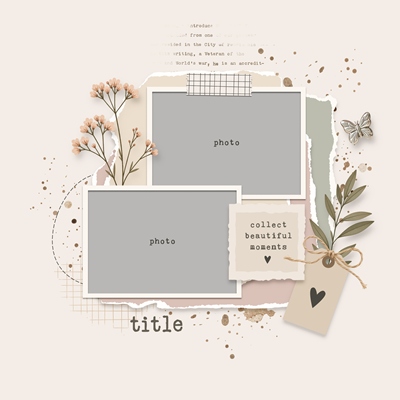
Today I’m working with the template you see directly above. It is from “Scrap Maps 16” by Blagovesta Gosheva at Sweet Shoppe Designs. I rotated it horizontally and removed and/or re-positioned some of the place holders for now:
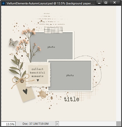
I have a plan for my layout and I know exactly which elements I’ll be adding that will look so much better as vellum knowing where I’ll be placing them. So, let’s get started.
This is going to be a nautical themed layout and I have one thing in particular I will use in place of the word art “tag” near the left side. I am actually going to use that tag’s base as a starting point for my first vellum element.
First, I’m going to hide the second layer of that tag, the word art and the heart element. I’m also going to make the tag’s base a bit bigger. That base layer is now the active layer:
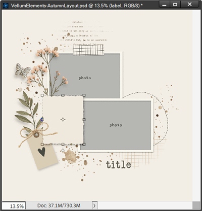
I set my Foreground/Background color chips to the defaults (press D). But, for right now, I want them to be swapped (press X) so that white is on top.
I don’t know if you’ve noticed, that tag base already has a shadow applied. And normally that would be fine. But if you’ve read my “See-Thru Title” post (mentioned above), you already know adding a shadow to vellum can be a bit tricky because it is semi-transparent.
I’ll be treating my vellum elements the same as I would working with a glass element. The ideal way to add the shadow is to create the shadow on its own layer.
Normally I would refer you to my “Tricky Shadows” post from October of 2025 for tips on how to do that. Not today; I have a different idea…
Shadowing Vellum Element
Today I’m going to cheat a little and that’s a bonus for you. Since that layer already has a shadow, I’m going to duplicate the layer, rename the duplicate to Tag and rename the original to Tag Shadow. I then clear the layer style from the Tag layer. And that layer is going to become my first vellum layer.
With the Tag layer active I grab the Paint Bucket tool and fill that layer with white and set the opacity of the layer to 50%:
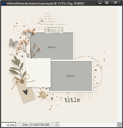
Yes, now that Tag layer looks a bit more beige than white. But that’s because the original tag (with the shadow) is still underneath. And next I’m going to accomplish two things at once. I will get rid of the original tag but keep the shadow!
With the Tag Shadow layer active I need to simplify the layer so that the shadow becomes permanently merged with the original tag. Then I Ctrl-Click the thumbnail of the Tag layer to make a selection around the white tag. Now all I have to do is press the Delete key and I now have a vellum tag with a lovely shadow:
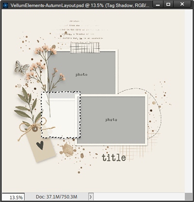
How easy was that? I can cancel the selection at this point. I then link the Tag and Tag Shadow layers together. This ensures that any resizing or repositioning I do with this tag moving forward, will also affect the shadow.
Let’s move on with the rest of this tag element…
Word Art Vellum Element
I have a word art card from the kit I’m using for this layout. I pull it into my file, position it over my Tag layer, and resize it accordingly:
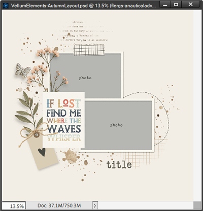
When I clip that card to the Tag layer I end up with this:
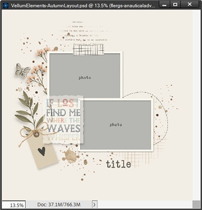
Well, that certainly looks like vellum, right?!? Perhaps a bit too transparent. In case you’re wondering why this happened, it’s because of the opacity setting for the Tag layer. I really want the colors of the words to be less translucent.
So, I unclip that card layer from the Tag Layer. Then I simply delete the background of that word card:
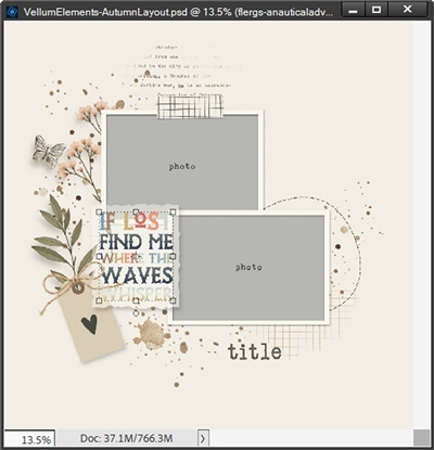
Note: If you’ve been following me for very long, you already know there are multiple ways to remove a background. In case you’re not sure how to do it…in PSE 2024 we can Select->Background and delete it. With older versions just use whatever selection tool works best for you and simply delete the selection.
That looks so much better. Now, if I wanted the words to be just a bit translucent (giving it a true vellum look), I could change the opacity of the words layer to 70-80%. But I’m afraid I’d lose some of the gradient effect on the last word! So, I think I’m just going to leave it as is.
Vellum Element Border
I am going to go one step further on this tag. I’m completely happy with the vellum look. But I think the Tag layer would stand out a bit better if I put a thin border around it. Let’s see how that will look.
I create a new layer above the “words” layer. I then Ctrl-Click on the thumbnail of the Tag layer to make a selection around the tag. Then I go to the Top Menu bar and select Edit->Stoke (outline) Selection.
PSE opens the Stroke dialog box. I set the Width to 10px, the Color to match one of the blue letters in the words (#86aaba), set Location to Outside and click OK to confirm:
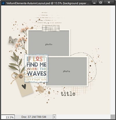
That looks perfect. It really kept that vellum from completely disappearing into the layout.
Now, because the words on that vellum tag mention waves, I want to include a wave element on the right edge of the bottom photo.
Trickier Vellum Element
Unfortunately, the kit I’m working with doesn’t have any wave elements that will fit there. But I do have a piece of clip art from Creative Fabrica that should work out nicely:
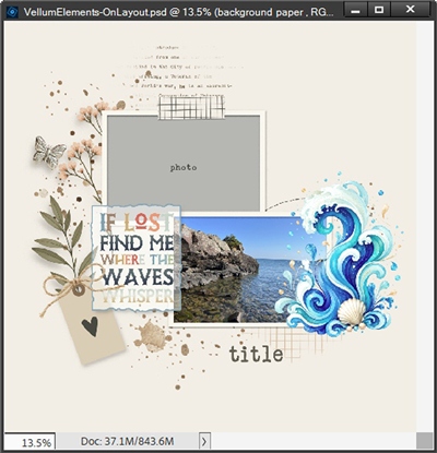
You can likely see that there is a lot of open space between the waves and surrounding water droplets in that element. This is going to make turning this into a vellum sticker a bit more challenging than it was for the tag above. But where there’s a will, there’s generally a way 😊
I’m going to zoom in fairly close so I can see those water drops better. If I simply press Ctrl-Click on the thumbnail of the “waves” layer I end up with a selection that looks like this:
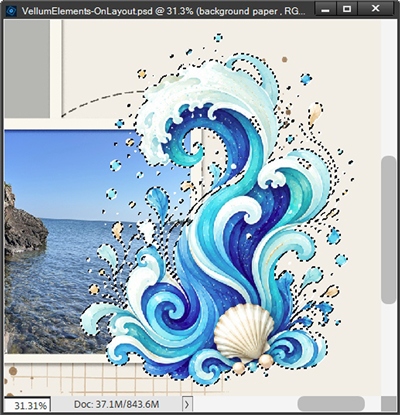
With all that empty space I just mentioned, filling this selection as I did with the tag above isn’t really going to work out very well.
Tricky Vellum Base
With an element such as this having all that open space, the best alternative is to create a solid background for the image. And I want that background to be on its own layer. So, I create a new layer below the waves layer which becomes the active layer. The selection should also still be active.
I ensure that my Foreground/Background color chips are set to the defaults and swap them so the white is on top. Next, I go to the Top Menu bar and click Select->Modify->Expand. I set the Expand By value to 45px and click OK to confirm. Now I can press Alt+Backspace to fill the selection and cancel the selection (press Esc or D):
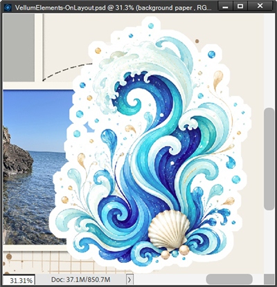
At first glance this looks like it worked out perfectly. But after taking a closer look I see one small thing that’s going to cause a slight issue. There’s one small spot off to the left of the waves that is still open. I’ve circled it in red:
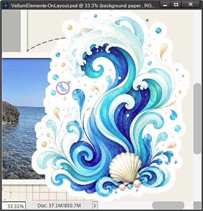
Could I ignore this? Yes. But I plan to add a shadow to the vellum layer so I’d prefer that spot wasn’t open. And it’s easy enough to fill that hole using the Brush tool.
Tricky Vellum Shadow
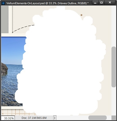
With that corrected white base in place, I can now go on to add the shadow using the same steps I used on the tag above:
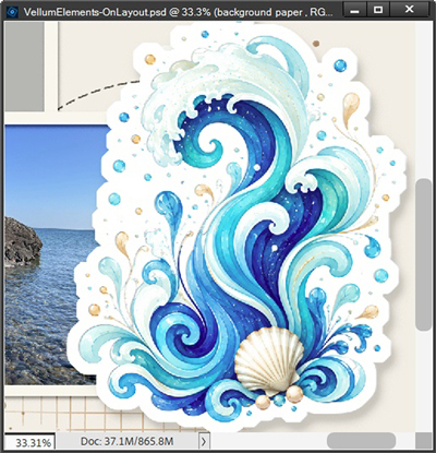
One last thing. I want not only the white base but also the waves to be somewhat translucent so the entire element looks like vellum. To do this I simply change the opacity of both the white base and waves layers to 60%. And here’s my finished vellum waves element:
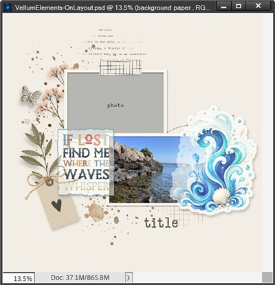
I’m so happy with how that turned out. I can still see the photo underneath those vellum waves.
I hope you can see how turning some elements into vellum pieces (stickers) can give you the freedom to layer things over top of other things but still be able to see what is beneath. And as I said in the beginning, this is another way to tone down the “chaos” in a layout.
I hope you’ll try using some vellum elements on one of your future layouts!
And here’s a look at my finished nautical layout:
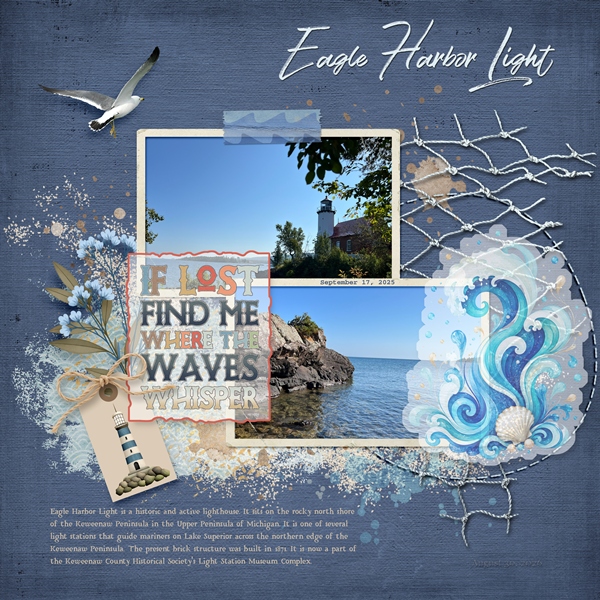
Note: The kit I used to finish the layout is “A Nautical Adventure” by Studio Flergs.
Yes, I did make some modifications to the vellum waves once I started pulling other elements into the file. I made them a bit smaller and more translucent. And I made some changes to the vellum word art tag.
I do know I changed the color of the tag’s border. But at this particular moment I don’t remember exactly what else changed.
And just for good measure, here’s another one of my layouts using vellum elements:
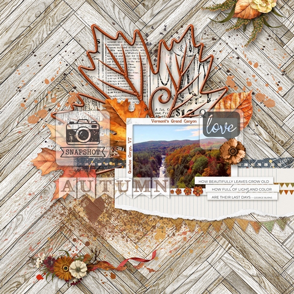
If you’d like more information on these layouts, you can find them in my 2026 Gallery. The first one’s title is “Eagle Harbor Light”. The second layout’s title is “Quechee Gorge”.
More Tips

One key recommendation is to keep your original element on its own layer and place the vellum “base” beneath it. This will allow you the most flexibility in controlling the vellum and element’s opacities separately if needed.
When creating a vellum element where you only want the outer edge to be translucent, there is an alternate method. Rather than using the Select->Modify->Expand method I used today, you could instead create just a vellum outline using the Edit->Stoke (outline) Selection method.
When creating vellum elements, you may need to adjust the Expand By number (or stroke size) depending on the word or element you are using. Choosing a smaller number will decrease the size of the vellum edge, and a larger number will increase the size of the vellum edge.
When creating vellum using typed words or other “free standing” word art, you can use either the “outline” or “expand selection” method.
You may need to play around with the opacity level of your vellum element depending on the background of your layout. A lighter background may require a lower opacity.
When applying a shadow to the vellum element, always remember to create the same kind of shadow you would use for a clear/glass element and keep it on its own layer. This is the only way to prevent making the vellum look darker than it should.

Artists are visionaries. We routinely practice a form of faith, seeing clearly and moving toward a creative goal that shimmers in the distance – often visible to us, but invisible to those around us. — Julia Cameron
Thanks for reading this week’s Tuesday Tip. Remember, if you have any suggestions or questions please don’t hesitate to “Message Me”. Check back next week for tips about textualized photos. Click “Follow Me” to stay in touch. I hope you have a wonderful week!
