Border Curves
In last week’s post I showed you how to create Curvy Borders using the Shear Filter. I know you’re going to be shocked (probably not) to hear that there is a way to create border curves without using a filter (so unlike me, right?!?). I wanted to show you last week but it would have made that post too long. So, today I want to show you how to create border curves using an underscore.
That’s right, today I’m actually going to create curves using a Type layer.
Alternate Border Curves Method
Quick reminder; I use Photoshop Elements (PSE) 2024. If you use a different version, some of my screen shots may look different from what you see on your screen.
If you read my “Type A Stitch” post back in July of 2024 you likely remember me mentioning that I’ve always had a horrible time digitally drawing any non-straight line that didn’t end up looking more jagged than smooth. Back then, after trying a lot of things that I thought should work – I was about to call it quits. Fortunately, later that year I discovered a method that was a game changer and am going to share that now.
I’m going to create a 12×12 file with a white background. Today I’m going to start by creating a curvy line using a font. Almost any font should work. I just need to be sure the underscore character is available and that it has straight/smooth edges.
I grab the Horizontal Type tool. I then set the Font to Arial regular, Size to 60.25, Color to black, Leading to Auto, Tracking to zero, check Anti-aliasing and I click the Center text icon.
I place my cursor roughly centered on my file. It doesn’t need to be precise, close is good enough. I then type out a line of “underscores” (Shift+Hyphen key) that extends across the page. Using the underscore gives a longer dash than the hyphen does, and the ends join seamlessly giving me a solid line.
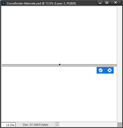
For once, I’m not going to simplify a Type layer before manipulating it. Instead, I click the Create warped text icon at the far-right end of the tool options (beneath Anti-aliasing):

PSE opens the Warp Text dialog box. I set the Style to Flag. I ensure the Horizontal radio button is checked, set the Bend to +95% and click OK to confirm:
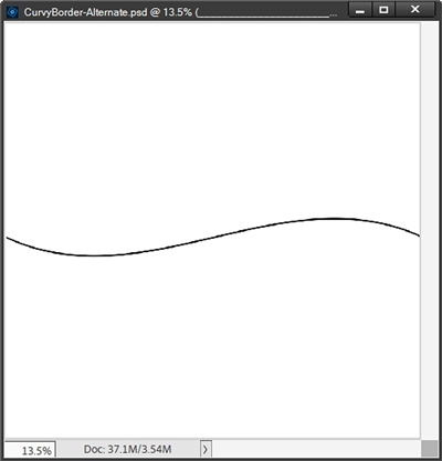
Note: You can play with the Bend percentage by pushing the slider all the way to one side or the other to get whatever curvy line you like.
That’s a very nice curvy line but I want border curves that are a bit more dramatic than that. That means it’s now time to simplify this Type layer. Before I do that, I am going to duplicate that Type layer, hide the original and name the duplicate to Curve #1. If you’ve been following me for any length of time, I know you’re not surprised I did that!
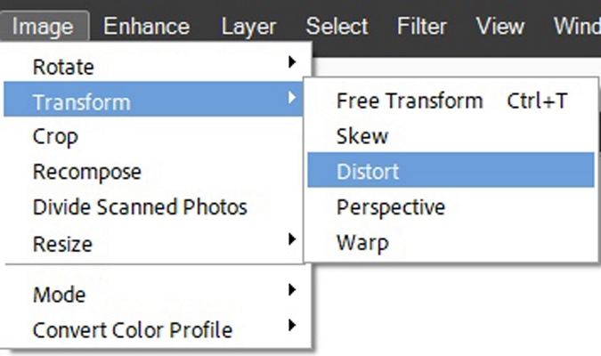
Then I simplify the Curve #1 layer. Now, with the Curve #1 layer active I can use any Transform tool that I choose to adjust the curves. I’m going to be using the Distort option. So, I go to the top Menu Bar and select Image->Transform->Distort:
PSE creates what looks like a normal bounding box around my curvy line. The thing is, with this bounding box, each of the anchor points is movable in any direction. That means I can grab any one of the anchor points and pull it or push it around until I see a shape that I like.
And the usual Resize and Reposition functions are still operational, so I have lots of room to make adjustments. When I’m happy, I just click the checkmark to confirm:
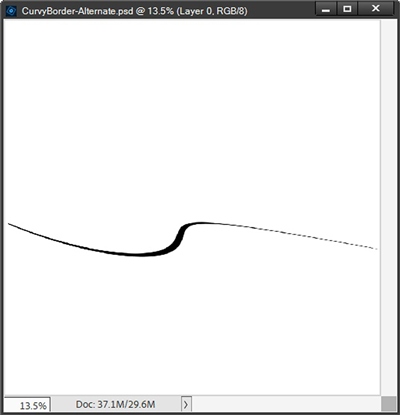
Next, I’m going to rotate it so it’s vertical, stretch it top to bottom (so the line is solid at both edges) and position it where I think it will work best:
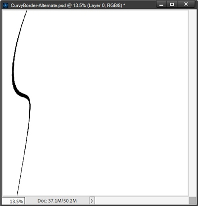
To complete this border, I need to fill in the area to the left of the curvy line. So, I’m going to create a new layer (Layer 2 for me) above the Curvy #1 layer. Then I Ctrl-Click on the thumbnail of the Curvy #1 layer. PSE places a selection around that curvy line:
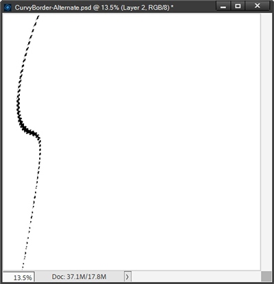
I need to invert that selection so the marching ants include the outer edges of the file:
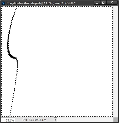
Clearly, I only want to use the part of the selection that is along the left edge of the file. So, I now need to use the Selection brush tool and subtract all the marching ants between the curvy line and the right edge of the file:
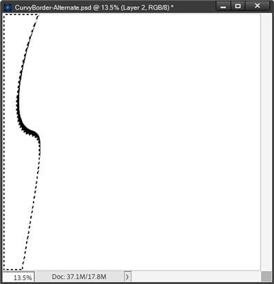
Now I press Alt+Backspace to fill the selection and cancel the selection (press D or Esc):
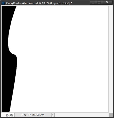
You might not be able to see it but there are a few spots where the fill didn’t go all the way up to the left edge of the curvy line. That’s easy to fix. I’ll just zoom in really close and fill any of those gaps using the Paint Bucket Tool. I’m not going to show another image at this point since at this small size it looks virtually identical
I want that fill layer and the curvy line to be a single image. So, I merge the new layer with the Curve #1 layer and rename the merged layer back to Curve #1.
Okay. I have the first of my border curves layers. I’m going to make one more. This time I’ll use a red color (#f40a0a) so it’s easier to see what’s what. I ensure my Curve #1 layer is active in the Layers Panel.
I’m also going to start with a shorter line for this curvy border. I grab the Horizontal Type tool again. All the settings except the Color, should still be the same. So, I set the Color to red, position my cursor approximately centered on the file and type my underscores:
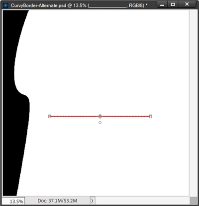
And just as before, I’m going to duplicate the Type layer, hide the original and rename the new layer to Curve #2. With the Curve #2 layer active, I select the Create warped text icon. In the Warp Text dialog box, I set the Style to Flag, ensure the Horizontal radio button is checked, set the Bend this time to +100% and click OK to confirm:
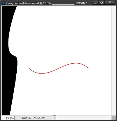
Did you notice that the length of the line and the 100% bend generated deeper bends and a smoother looking line?
Let’s take a look at the first black line again:
Generally, the size of the line and the percentage of Bend will dictate the end result. So don’t be afraid to play around with both and see how things change.
Now I’m going to simplify Curve #2, rotate it 90 degrees to the right and position I so it’s directly over the black border:
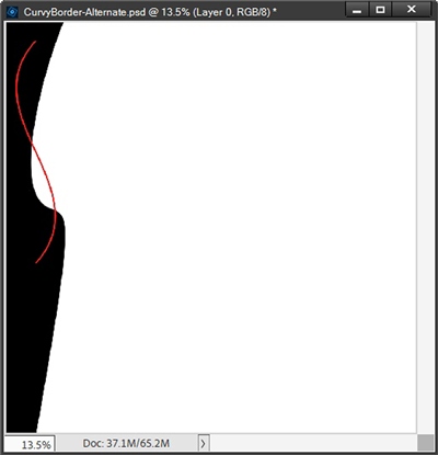
I placed it over the other border so I can see how things look as I go through the next few steps. And for the second of my border curves layers, I’m actually going to use the Skew tool instead of Distort. With Skew, the anchor points can move in two directions, horizontally or vertically:
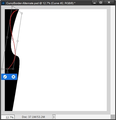
I’m happy with how this looks so far and I’ve pressed commit to confirm. I do want to make the curved line longer, and with more curves, so I’m going to duplicate the Curve #2 layer. I then reposition the duplicate layer until I see the look I want:
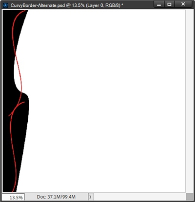
I also free-rotated it a bit to the right so I could still see some of the black border at the bottom.
Before I create the fill for this red layer, I need to erase the top “tail” of the lower curvy line so it looks like a seamless line (at least on the right edge). All I have to do is zoom in fairly closely and use the Eraser tool to make that tail go away:
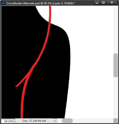
Note: If you’d be more comfortable using a layer mask to make this erasure, please feel free to do so.
I zoom back out so I can see the entire file again. Oh, and I don’t need to worry about the tail inside the red line. That will be covered when I create the fill. Now, I need to merge those two curvy lines together so I can create the fill the same way I did with the black layer.
I ensure my Foreground color chip is the same color of red I used for the line. Then I just make a selection around the red curvy line, invert the selection, subtract all of the selection to the right of the inside edge of the line. Then I create a new layer above the line and press Alt+Backspace to fill it with red:
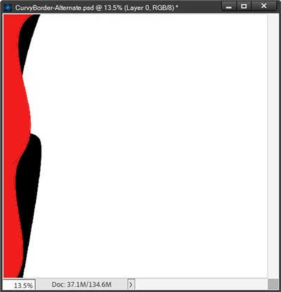
Those small gaps appeared again and this time they’re a bit more noticeable. But just as before, all I have to do is use the Paint Bucket Tool to clean that up:
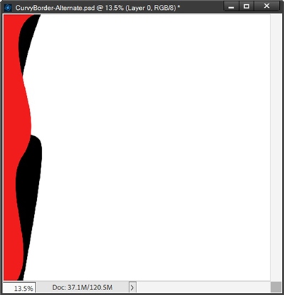
Well, that’s a very different looking layered curvy border!
But I feel like it needs something. This time I just duplicated the red layer, recolored the duplicate to a nice shade of blue (#154398) and moved it beneath the black layer in the Layers Panel. Then I used the different Transform tool options to come up with a completely different shape:
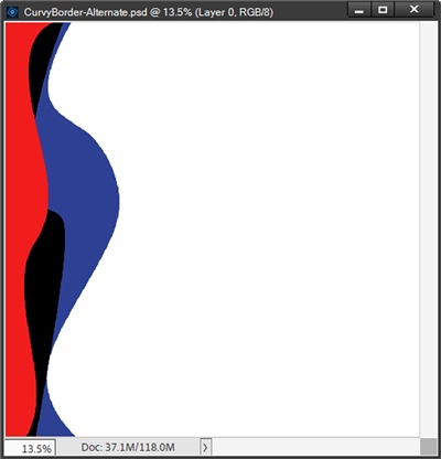
These layered border curves look a bit more balanced. Now I can “cut” this to size the way I did with the first set of borders last week and save this a PSD to use as a border curves template later.
I know I made these curves a bit extreme. I was just trying to give you an idea as to how versatile this method can be. And here’s a look at a layout I made with curved borders using this method:
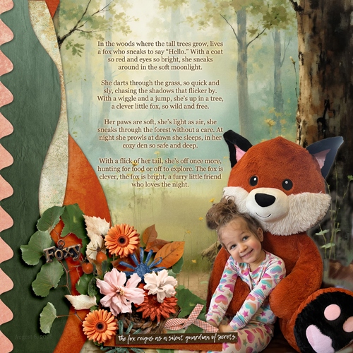
If you’d like more information about this layout, you can find it in my 2026 Gallery. The title for this layout is “Foxy”.
Now that you have seen this alternate to using the Shear Filter, you should be able to tell that this method gives you a whole lot more flexibility. Either way, you now know of two ways to create some interesting curvy borders.
Tips For Curves

To create your starting line, just about any simple serif or sans serif font will work. Just be sure the underscore character is available. Some fonts don’t include all of the punctuation marks and special characters.
Avoid any fonts that have rough/tattered edges. Those will only lead to a tattered curvy border edge. But if that’s the look you’re going for…have fun with it!
Using the underscore gives a longer dash than the hyphen does, and the ends join seamlessly. Using the hyphen will leave gaps between the characters.
Choosing a large font size and extending the line across the width (or mostly) of the page will make things go quicker.
Remember, the length of the line and the percentage of bend will affect the curve pattern when using the Text Warp – Flag tool. Shorter lines will almost always tend to create a smoother curved line.
When using the Transform tool options, there’s no exact science as to which mode (Skew, Distort, Perspective and Warp) will work the best. I generally start with Skew and typically avoid Perspective. Experiment with all or simply use the one that feels most comfortable for you.
And just as I said last week, experiment with different kinds of curved shapes. Don’t be afraid to put more than 2 bends on a single curvy border.
Using the tilde character (~) is a good way to create a zigzag or ricrac look. But you won’t be able to create a single “gapless” line just by typing. This requires typing one tilde, making a copy and joining the two characters to create a seamless connection. You can then merge the two layers duplicate the merged layer and join those two layers together. Then repeat the process until you have the length you want.
It is better to fail in originality than to succeed in imitation! – Hermon Melville
Thanks for reading this week’s Tuesday Tip. Remember, if you have any suggestions or questions please don’t hesitate to “Message Me”. Check back next week for an extra tip about templates. Click “Follow Me” to stay in touch. I hope you have a wonderful week!